Showing posts with label GPP. Show all posts

Thursday, February 7, 2013

Revisiting Art Journals and Clipping Layers

Tonight I learned how to make a template with PS Elements which I used to assemble this collage. The template was created with layers and shapes and clipping layers together.  I don't know why it took me so long to get to the point of figuring out how to do this, but I know I will find the technique very useful.  It's really not hard.

The template before adding images.
Well, once I made the template, what was I to put in the blanks?   A quick scan through image files took me to folders with journal shots.  I chose xo and heart themed pages for this collage.  Next I added a subtle texture layer by Kim Klassen called Peony.  Finally, the quote was added.
I might paraphrase this quote to say, "At the touch of love everyone becomes an artist."

Monday, April 30, 2012

GPP Crusade 61 - Restraining Order

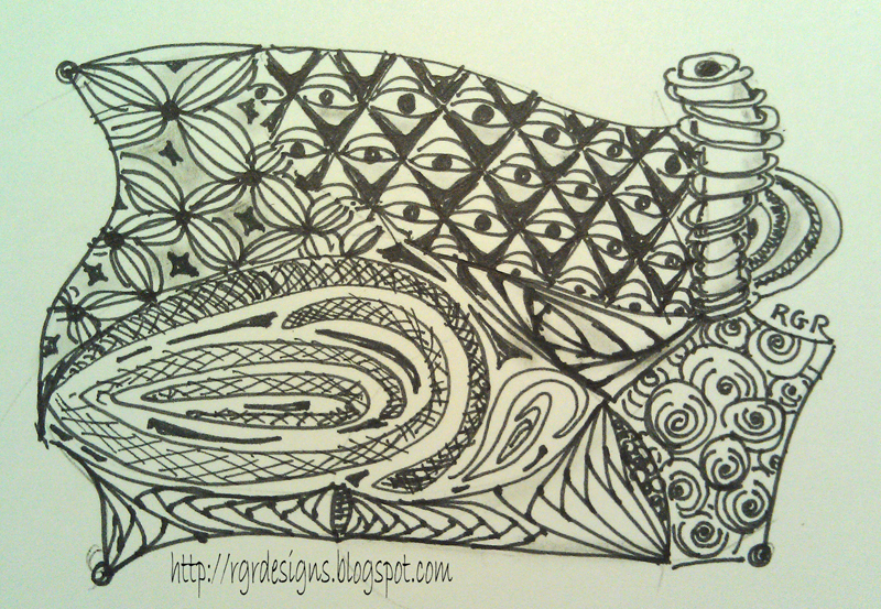
This is a simple journal page for the last GPP Street Team Crusade - Restraining Order.  The challenge was to create a simple journal page that we didn't feel compelled to cover with journaling or other details.   This page started with a bit of gesso stenciled on.  The paint was scrubbed and stenciled on with leftovers from a book project.  I poured out a bit of Golden fluid acrylic for an illustration I painted and I couldn't waste those few precious drops!  That's when I started doodling the paint on the page using a pointed calligraphy nib.


This bit of ephemera happened to be on my art table.  It came from a fortune cookie.  Do something daring.  OK - I'll post this strange for me page from my journal.  And what else can I do?

I scanned the page and converted to black and white.   What if I made a digital brush?  So I did and look what happened next....


I've been all wrapped up in patterns and repetition which is what I think inspired the digital print I created.  Following are a couple Zentangles I drew.  Have you tried it yet?  It's fun and relaxing and very portable.


This is one of my favorites - probably because of the organic lines in it. 
If you have been a follower of the GPP Crusades, you know this is the last for now.  I had my page done several weeks ago, but haven't had an opportunity to post due to busy circumstances with family.  I'll always be grateful to Michelle Ward for all her generous tutorials and challenges from the past years.  You can still go back to see the crusades and do them on your own.  Go ahead.  I dare you!

Saturday, February 25, 2012

GPP Crusade No. 60: I Love...

It's been a few months since I participated in a GPP Street Team Crusade.  Besides following Michelle Ward's prompts for the challenge, there is the fun of reading the blogs of the other participants.   I've made some wonderful friends through the comments and emails that have been shared through this group.  But, sometimes life has other priorities and I needed to step back... and I read today that there will be only one more crusade after this.  I'm SO glad that I'm jumping back in right now because it gives me an opportunity to say it loud from here:
 I love you Michelle Ward!
Mixed media with digital text.

I created a two-sided page on Strathmore Mixed Media Paper.  This paper is great!  It's smooth surface made writing I Corinthians 13 [the Love Chapter] with a Sharpie pen a pleasure.  Next I used a favorite technique gleaned from an earlier crusade - gesso resist.  Using a heart stencil, I applied tinted gesso with a sponge roller.
After the gesso dried, I used a limited color palette of transparent raw sienna, quinacridone magenta and phthalo blue, and transparent mixing white (zinc white).  Since the paint was thick (Liquitex from tubes), I thinned the paint with matte medium and water.  I wanted rich pigments and yet retain tooth to the paper for subsequent layers.  Using the same paints, flowers and hearts were stencilled on the page.  Circles were made using bottle caps for stamps.

Page without the digital journaling.
 Now I let this set for a few days before deciding what to do next.  Using a white Sharpie poster paint marker and Inktense pencils in similar colors to the paint, I brought out some of the shapes and added a bit of doodling.  Love was written with the Sharpie marker and shaded with the Inktense pencils.  A bit of additional doodling was added with a Sharpie pen.  I can go back to this page and add more doodling, but I decided to stop now and scan it so I could add a digital message.  When I read today that Michelle is retiring the crusade after next month, I knew what I had to say.
Here's a wink to you, Michelle!
As I stated earlier, I painted both sides of the paper.  One edge is deckled (paper torn against a deckling ruler).  I folded the page not quite in half to leave space for adding a binding later with my Zutter Bind-It-All.  My Martha Steward scoring board and a ruler helped me get a clean fold on this heavy paper.
This page used the same paints except for the transparent raw sienna.  There was no journaling on the page either.
Last night I found a face (Sharon Tomlinson, thank you) and brought it out subtly with Inktense pencils.
Inktense go on like a regular colored pencil, but when you wet the color, it intensifies and you can move it with a paint brush.  Once it dries, it is set.  I have a small set of 12, but would love more some day.
Please look into the Green Pepper Press Street Team Crusades.  They are still available for viewing and learning and doing!  Michelle has been a generous teacher and a great cheer leader.

Tuesday, September 20, 2011

GPP Crusade No. 55: Disappearing Act - with Stamps and Stencils

Journal page close up.

Do you want to have fun creating lost and found edges?  What does that mean?  The above stamped image shows distinct edges and places where the edge is "lost" when the stamping colors merge with the background.

To learn how to create this look, read Michelle Ward's great tutuorial on this month's challenge.
Just follow this link.

 The first two journal pages were prepped with gesso.  Then I brayered Phthalo Green, Phthalo Blue and Green Gold on the pages.  Next I brayered the same color sequence over a stencil that I laid on the above page.
 I stamped on this page. Once again, I used the same colors of paint on the stamp that I used to color the page.
 I put small squirts of paint on the palette and a streak of matte medium.  They gently blended when I rolled the brayer back and forth through the paint.  I was careful to keep the roller in close alignment with the paint so the colors wouldn't blend all together and maintain some of the pure colors.
This stencil is by the Crafters Workshop.
 You get a better idea of the gradation of colors on this shot where I rolled the paint through the stencil on a white page.
 This stamped image shows what I stamped on the prepped page.  I continued to stamp off the paint to get the ghost images on the page.

Following are the pages that I created in my journal where I attempted to make lost and found edges.  I was using up paints on my palette from a different project. I applied paint with a stencil brush over a variety of Crafters Workshop stencils.  They weren't as effective as I'd hoped.  I learned there is trial and error involved with this process... easier said than done.


Thanks again to Michelle Ward for her inspiring and informative tutorials at the Green Pepper Press Street Team Blog.  Check it out!

Saturday, September 17, 2011

GPP Crusade No. 54: Mind Games -Inspired by the Iowa State Fair

I love the colors that surround me at the Iowa State Fair.  When Michelle Ward posted the August Challenge, Mind Games, I knew exactly where I would find my inspiration for the challenge.  This was a perfect chance for me to do a simple study of modern vs. traditional pigments.
Be sure to go to the GPP site to read what Michelle had to say about this challenge.

Have you ever tried mixing colors and just came up with muddy colors?  You learned in school that red + blue = violet, yellow + red = orange, and yellow + blue = green.  But it's not quite that simple.  If you mix the wrong versions of these primary colors, you will not end up with the pure colors you may have desired.
Try mixing only modern (organic) pigment colors together.  You will get pure, vibrant mixtures.
Traditional (inorganic) pigments work well together, but the mixtures will be more earthy.
Golden Artists Colors has a great reference sheet you can check out here and you can print it out for your reference. Follow this link for Golden's Organic vs. Inorganic Pigment list.

Back to the fair...

I chose the vegetable competition to provide inspiration for my Traditional (Inorganic) Color Palette (Cadmium Yellow Medium, Cadmium Red Medium and Cobalt Blue).
In addition to the primary triad, I used titanium white and ivory black.
In addition to the journal pages I've shown here, I painted entire pages with variations of the mixtures that I can use as the start of future journal entries.  I digitally extracted from those pages for the inspiration collage.

As much as I love daytime at the fair, the night holds my heart.  The midway and vendor lights are exciting against the evening sky.  Last year I discovered that the RetroCamera app on my phone takes the coolest shots at night, and I'm happy to share a few of those shots here along with my painted mixtures.
 The Modern (organic) Palette was created with Yellow Light Hansa, Phthalo Blue and Quinacridone Magenta.  Titanium white was used to create tints of the mixtures. It makes these transparent colors more opaque.  If I had wanted to retain more transparency, I would have mixed them with zinc white.

I hope you enjoyed this post.  Getting all this information compiled together was important to me and it's coming late.   Come back for the September challenge.  I'm hoping to be back on schedule. ;-)

Friday, July 22, 2011

Summer Treats Palette - GPP Crusade No. 53

Virtual color palette extracted from scanned paint reference journal.
 A little scanning, Photoshop Elements, and imagination came together to come up with my Summer Treats Palette.  This month's challenge from the Green Pepper Street Team was the motivation to take a new look at my paint reference journal.  I use spiral bound watercolor paper tablets to develop palettes for many of my paintings.  I like to use a limited number of paints from the tube and develop a range of shades and tints so my paints will have unity.  This is one example of how I may proceed.
Scanned paint reference journal page.
These are smears of acrylic paint - Liquitex and Golden brands - that were applied to the page with palette knives.  Some colors are pure from the tube and others are blends.  I also added titanium white to some of the blends.  I write notes around the smears to help me recreate the colors.

I developed this palette last year while planning a painting for Unforgettable Art.  I used much of this palette for paintings of purple coneflowers.  Sadly, one of the paints is no longer available, so I'll need to do another version of this palette to come up with a good compromise.  Sounds like fun to me!

Be sure to visit the GPP Street Team blog to see how Michelle Ward prompted us for the challenge.  Maybe you'll be inspired to join in.  Even if you don't blog yourself, try this.  It was lots of fun.

Tuesday, June 14, 2011

GPP Crusade No. 52: Seasonal Wardrobe

Cover art on Strathmore Visual Journal
 This month Michelle Ward challenged Green Pepper Street Team participants to share seasonal "wardrobe" changes in our art.  Do I change my color palette with the change of the seasons? 
How does the changing of the seasons affect my art?

I tend to work with a limited color palette and usually prefer saturated colors.  But looking back at the past winter months I see that I played a lot with softer colors, especially aqua.  Maybe a desire to be at a warm beach during the long cold winter was influencing me.

Lately, I've been experimenting with bright green.  Today's project was to embellish the covers of a Strathmore Visual Journal.  They have a tough, shiny cover that I sanded to give more tooth for the paint.  Then I applied gesso that I distressed with waxed paper.  While the gesso was wet, I lay a piece of waxed paper on the surface and lifted it off.  The gesso dried with an irregular texture.
Next, I painted a thin layer of lime green paint on the surface and dabbed some off with damp cheese cloth.

The special seasonal touch to this cover came from the leaf masks. A short storm left bunches of leaves and twigs on the ground yesterday. I picked up a few and pressed them over night.
I laid the leaves on the covers and sprayed a couple colors of diluted Liquitex Acrylic Ink.

I really like the results of this project so far and have started a similar project on canvas.

This crusade has me thinking about the influence the seasons have on my work and I can use that awareness.
 When I get stuck for inspiration, I can let the unique qualities of the season spark ideas.  The bright green that I'm working in seemed too intense when the ground was covered with snow.  But now the outdoors is bursting with green and it just seems natural to be working with it.


Thursday, March 31, 2011

GPP Crusade No. 49 - Journaling Forensic Self Portrait

Journal spread featuring a tea I like.
 Let me start by saying that I am very happy to be getting a post up today.  My lap top died last week. The hard drive is kaput.  The new hard drive that Hubby purchased turned out to be defective.  We are waiting for the replacement to come in the mail.  Now I'm using my computer that is operating on a Linux operating system from a disk!  My husband is a genius!

This post features a couple journal spreads I created earlier this month.  They are my entries for this month's Green Pepper Press Street Team Crusade.  Follow the link to learn more.

The above journal spread was built on pages that were prepped with leftover paint during a painting session.  I roughed in the face at the same time.  I decided to use this spread for the challenge when I opened a bag of Awake Tea and the color coordinated with my spread.  I've been drinking a lot of tea lately and enjoy a good black tea.
The page was embellished with tea bag ephemera, rubber stamping (clocks), chalk pencils and stenciled ink.

Layers of paint, ink and ephemera on one half.  The right side started with scrapbook paper.
 I've been following Strathmore's art journal free online workshops.  In a prompt to journal about favorite sounds, I remembered the sound that the rows of flags make snapping in the breeze on Memorial Day.  I created this spread to remind myself of that sound and to show my patriotic side.

The completed spread.

Many layers of paint and ink went on the left half.  A patriotic themed scrapbook paper was adhered to the right side.  Distress inks helped to unify the color of the two pages.  Stenciling with a doily gave the pages a common texture.  I collected canceled stamps for the borders.  The photos were taken at my home town Memorial Day observance.  I put the top left photo on a flap so I could journal more personal thoughts under it.

Monday, February 28, 2011

GPP Crusade No. 48 - More Evidence Journaling

Evidence page featuring a symphony concert we attended.
 The February prompt for the GPP Street Team is to create another evidence page in our art journals.  The theme is to come from an event attended last year, so Michelle Ward cleverly named the crusade: "Been There, Done That."  Read more at the GPP blog.

I've just completed half of my spread that you can see above.  Hubby and I attended a very special concert where the Central Iowa Symphony and Fort Dodge Symphony joined together.  Mahler's 1st Symphony was performed during the second half of the concert.  Near the conclusion of the performance, the French horn section is featured.  At the conclusion, the French horn players all stand as their fanfare fills the air.  It was a moving experience that I won't forget.  And it was so meaningful...


Beginning stages of the journal spread.
 A dear friend who had been a French horn player lost her battle with cancer the day before.  Her daughter, who is also a superb musician, was playing the French horn in the first chair position in the concert.

My friend was also an artist. We became good friends at the pool where we both did our workouts.  We quickly learned that we had so much in common.  Working out was more fun when we discussed the latest "Watercolor Artists Magazine" or the projects we were working on.

For this journal spread, I chose aqua and gold acrylic paint and gesso to prep the pages.  Aqua is for the pool and gold for the French horn.  The spiral stamp reminded me of the shape of the horn.

I adhered ephemera from the concert on my page with soft matte gel.  Chalk and oil pastel were added for more color.  I also spritzed the page with walnut ink and wiped off the excess.  Journaling was added with a Sharpie marker.
As for the right hand page, I plan to put a memorial to my friend on it.

Saturday, January 29, 2011

January Art Journaling - GPP Crusade 47 & Strathmore Workshop

Detail view of new art journal page.
Here's a fun winter project you should try.  Strathmore is offering free on-line workshops.  The first was introduced earlier this month and is taught by Pam Carriker.  Check out this link for more information.

Early in the journaling process.
 Pam guides us through a project that invites you to re-use previously created art.  Start by making copies of your art.  I used copies of monoprints that I created for the GPP Crusade No. 39.I cut out the plain butterflies and some border pieces.  Using scraps of the same paper, I punched out flowers and leaves and hearts.  They were adhered to a Strathmore Watercolor Paper Visual Journal. This paper stands up well to all the layers that went into creating this page.  I used a charcoal pencil to draw some details and outline some elements.

Layers of gesso and oil pastel have been added.
 I tried to cut loose and not judge too much.  But I have to admit that I was feeling discouraged at this point.  Seemed like I had an ugly duckling in my hands... but we know how that story turned out.

The completed page.
 Maybe it's not a beautiful swan, but I'm happy with the results.  I was stretched and learned some techniques that I know I can use in future art.  The following page used some of the same techniques.
GPP challenge using some newly learned techniques.
 The Green Pepper Press Street Team Crusade No. 47 - It's A Wrap challenges us to create an evidence page using gift wrap from Christmas and to journal about gifts given, received, etc.  We use very little gift wrap these days.  I love reusable gift bags and tissue paper.

This page started in the same Strathmore journal.  I wrinkled a piece of tissue paper that had red and green circles, then applied it to the page with matte medium.  I purposefully did not completely flatten the paper which left wrinkles and distorted the circle pattern.  I cut out the poinsettia from a scrap of paper that managed to come home with us from the in-laws.  (They are great about recycling regular gift wrap.)
The poinsettia was also applied with matte medium.

I knocked down the white background and neutralized the colors a bit with some walnut ink and a thin glaze of green oxide paint.  Charcoal pencils, gesso and oil pastels add more character to the page.  But the real star of this page is my new Sharpie poster paint markers.  They were on my Christmas wish list along with Sharpie pens.  I got Sharpies in spades.  In addition to my requests, I also received a large assortment of regular Sharpie markers with fine points.  I have NO excuse for not journaling.
I very loosely wrote over the top of the images.  I'm trying to not make the pictures so precious. Using a wet, juicy marker helped accomplish that goal.

So there you go.  That's my art out-put for the month.  I hope to spend some time at my easel very soon.

Tuesday, December 7, 2010

GPP Street Team Crusade No. 46: What's Your Hang-Up?

Previous GPP Crusade art framed and hung with related art.
 The final challenge presented by Michelle Ward for 2010 is to frame and hang some of our own art.  I have framed many of my art pieces, but many are not hanging on my own walls.  Thankfully, some are at the I Scallon Gallery in Ackley, Iowa and waiting for new homes.

Earlier this year, I created a page for this challenge.  I had originally intended to add the page to a journal I will bind with the year's challenges, but liked it so much that I put it under glass on black matting in a frameless frame.  Then I set it aside not creating a place to hang it.  I came across the art again shortly before Michelle put out this Crusade challenge.  I was already thinking of putting a narrow black frame around it and followed through with the thought.  I liked that better.  Now I just had to figure out where to hang it.

I decided to move a calendar and remove a wall quilt that had been hanging beside our lower staircase for several years.  It's an awkward space that gets a lot of traffic.  But I forged ahead...

A grouping of related colors and inspirations made sense to me.  As I wrote in the earlier post, I had been influence by Matisse to use black with the vivid colors I had laid down on my paper.  A framed postcard of his art is in the grouping.  Cezanne had influenced Matisse.  A postcard of that art is also in the group.  A print by Kandinsky that complements my color scheme and art sensibilities was added.
The silhouette painting on the far right is a watercolor that I painted several years ago and it had been in a solo position on a small wall.  It added balance to my grouping and helped to fill the space.

This was a good challenge for me.  It was good to put inspiration and results together.  I ended up calling my painting "XO Matisse."

Thursday, September 30, 2010

End of September Pot Luck including GPP Crusade No. 44


You might think I'm just scraping by....
In a sense, I have been.  The September Green Pepper Press Crusade challenged us to prepare a journal page by scraping on paint.   I often use a palette knife, but an old credit card makes a wonderful tool. 

This time I also used some unused plastic dividers from a storage tray... you know, the kind found in the fishing tackle section of the big box store.  I buy them to store beads.

I really didn't have a lot of time to spend on this crusade.  Good thing it was simple.  I started with paint colors I was considering for some "serious" art.  That decision served me well.  I was hoping to replicate a color mixture that I had used previously.  The teal color wasn't turning out as I expected.
After scraping around on my journal page, I remembered that I had forgotten to mix a bit of red with my blue & gold.  Yes, I have this written down in another journal, but I thought I had it memorized better.

I've only shown my "official" crusade page, but I scraped paint more simply in another journal to use up the paint.

The lighting was less than optimal for this flat on shot, but you can see the variety of marks that I could make with my little scrapers.  I wonder what Michelle Ward will challenge us to do next?

This is a little mixed media piece in progress.  It's part of a trio that I painted for this upcoming event:

I'm looking forward to hanging out with fellow artists at Snus Hill Winery in Central Iowa.  Since we will be indoors, it will be a great day to shop for art and taste some wine.


More ATCs for this event (which will make them ACEOs).  Names.  I will be following up soon with replies from my previous post. 
And just in case that wasn't enough, I've been in rehearsals with our church choir.   We will be part of a mass choir (nearly 200 singers!) singing with Simon Estes on Sunday, October 10th at 3:00 at Cornerstone Church in Ames, Iowa.
The proceeds of the concert will benefit Habitat of Humanity in Story County.  Our choir is joining the high school choirs from across the county to perform beautiful music.  Mr. Estes is a world renown bass/baritone.  If you are in the area, this will be a treat for your ears.
Well, I better get back to preparing for this coming Sunday!