Showing posts with label photography. Show all posts

Saturday, March 2, 2013

The Eyes Have It

Beyond Beyond Assignment - From Above
Shooting a subject from above is challenging.  We don't usually view the world this way unless it is our shoes or maybe the sand along the beach while searching for shells.

In Beyond Beyond we were encouraged to take shots from above.  I tried a few things unsuccessfully.  The subjects were really flat and boring shot this way.  I decided to try a still life of some of my eye makeup.  The round brushes and tubes would roll away from their placement on my smooth surface.  I think putting the rumpled cloth beneath them helped save the shot.  Not only did it stop the items from rolling, the fabric folds gave the light more places for shadows and textures.

In Photoshop Elements 4.0, I enhanced the lighting with a gradient layer and levels adjustment layer.  Kim Klassen's texture layer, Cora, was applied twice and using different blend and opacity adjustments for each layer.  A text layer was added. The finishing touch was to add the frame on a separate color fill layer which was also adjusted for blend and opacity.

Tuesday, February 26, 2013

Ministering Angels

What a few enhancements can do for an image.
 I'm so happy with the editing techniques I'm learning from Kim Klassen.  This time I combined a "recipe" from Beyond Layers with inspiration from Beyond Beyond and Texture Tuesday.

Enhancements include the filters high pass and gaussian blur as well as layer adjustments to levels, saturation, gradient and color fills. This was topped by Kim's texture layer Mary from the Downton Collection.
Cropped only, no enhancements.
 Even though this picture has a cluttered background and a dark exposure, I had hope for it because of the highlights on the angel's head, praying hands and tops of the wings.
Using the gaussian blur helped push the background back and when I erased the angel from the blur layer exposing the focused layer, I gave it the emphasis I desired. (I'm still working in PSE 4, an old version of PS Elements that doesn't have the masking capabilities that new versions have which is why I literally erased the blurred angel.)

There were ten layers when I completed this image.

A few years ago Mom gave me this garden angel to thank me for helping when she had health issues.  I placed it by roses in my garden. One of my sisters and I had a great day selecting the roses. A pretty yellow variety was to remember my Grandma by, but the rabbits and Japanese beetles have taken their toll on it.  I think last summer's drought finished it off.  Obviously, this angel doesn't have mystical powers to ward off enemies in my garden, including the dandelions popping up around it... But it reminds me of Mom and how when we give of our self to others, we may seem like an angel to them.  The Bible tells us that God sends angels as ministering spirits to help us in time of need.

Earlier today I finished a novel on my Kindle called "Not A Sparrow Falls" by Linda Nichols which is a free download from Amazon at the time of this posting.  I wasn't sure I liked it when I was in the first couple of chapters, but I decided to keep going.  Soon I was hooked.  There are references in the book that go with this image very well.  If you have a Kindle, you should check it out.

Tuesday, February 5, 2013

Framing a Fall Walk


Brookside Park, Ames, Iowa
 In my effort to get back into the practice of editing images for Beyond Layers assignments, I chose a shot I took with my HTC Thunderbolt last fall on a glorious Sunday when Hubby and I went for a walk at a local park.

The point of the assignment was to add frames to our images which is just what I did to help draw your attention toward the biker on the path.  I had a similar shot with no biker, but the human element made this seem more interesting to me.

The light was quite bright and scattered across the image - even in the shadows.  I played with the levels and added a color layer to help boost the warmth I felt that day.

Next I added two frame layers.  One is quite broad and is not very obvious.  I used it to darken the outer part of the image and make the center seem brighter in contrast.  A narrow dark border was added to finish this off.  Both borders are heavily feathered to blend into the shot.

I like knowing how to make this vintage-style border that is similar to a quick action I can do with the PicSay Pro app on my phone.

Tuesday, March 27, 2012

More Magnolias - Vintage Style


One of the challenges of photographing Magnolias is finding a focal point when the whole tree is bursting out in blooms.  Last week there were just a few buds fully opened and I was able to get this shot by holding the camera above my head.
It's busy shot, but I was able to bring out the foreground blooms with the help of Kim Klassen's texture layers.  I added a couple layers of The Veil to the uncropped image.  Then I chose a selection to crop and add more texture.  Music Lovin' and Lilly were added to this image.  All layers were adjusted with blending modes and varying opacity.  I erased the texture from the focal blooms on all but one layer of The Veil.

The day was overcast, so I needed to adjust the levels before adding the texture layers.  There had been a soft rain earlier that afternoon.  The wet branches reflect the light grey of the sky.

I'm a huge fan of limited color schemes when I paint, and I like that this image has a limited palette.  The bits of green are a sweet bit of complement to the pinks of the magnolias.

I'm submitting this image to Texture Tuesday, the Pink Edition.  I hope you'll go check out the other images here.  You can see my Flickr stream here.

Thursday, March 22, 2012

Magnificent Magnolias - O Magnify the Lord

It's color week in Kim Klassen's eCourse, Beyond Layers.  Wednesday's color was pink.  The timing couldn't be more perfect.  Look what I saw just outside the door when I left work!

The magnolia blossoms look like hundreds of votive cups and the branches are like arms lifted up to Heaven worshipping the Lord God, our Creator!

I did very minimal editing to the images... just level adjustments to lighten up the shots.  The sky was overcast yesterday, so the lighting was quite soft.
The story board template came from Kim's eCourse.  I'm still learning how to use it.  I want to change the top middle image, but haven't figured out a short cut to doing that yet.

Wednesday, March 7, 2012

Happy Heart Monarch

Kim Klassen "Happy Heart" texture applied to my image
I was away from my laptop for more than a week attending to a family matter.  I told my Hubby that right after missing him, I missed editing images!  So before my busy day away from home gets started, I checked out the latest Texture Tuesday assignment at the Kim Klassen Cafe.

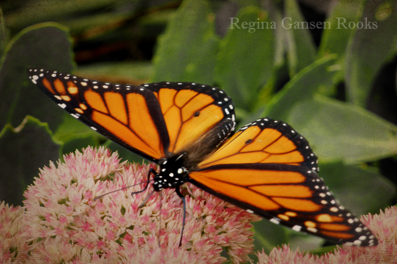
Every fall, butterflies visit my back yard garden and feast on the nectar of the Autumn Joy Sedum plants.  The butterflies are usually so preoccupied with their feeding that I can get fairly close to them.

I used minimal editing on this shot.  After croppping, I balanced the levels and desaturated the green to visually push the foilage back.  Two layers of the Kim Klassen's texture "Happy Heart" were added and the multiply blending mode was applied.  I erased the texture over the butterfly from one layer.  (For just a short while, I'm still using PSE 4.0, but will be upgrading very soon when my Wacom Intuos 4 tablet arrives. Then I'll easily mask out areas.)

This editing was a simple fix to help pop the butterfly from the busy surroundings.  I see the white spots like jewels set around the most beautiful stained glass.  Our Creator God is a magnificent artist!
"When I look at Your heavens, the work of Your fingers,
  the moon and the stars, which You have set in place,
  what is man that You are mindful of him,
  and the son of man that you care for him?"

Thursday, February 23, 2012

A Barn and More Treasure from James


This barn always captures my attention from afar.
  Do you ever take the slower route to your destination?  You may be rewarded in seeing treasures you would have missed while flying down the interstate highway.

A few years ago, I noticed this barn in the distance while taking one of our favorite back roads.  I am drawn to that barn like a moth to a flame.  My husband often offered to stop so I could photograph it, but I would wave him on with excuses about the terrible, harsh mid-day lighting.  It was true.  I knew an image would wash out and there would be little contrast.

But one day I was traveling on my own and turned down the gravel road so I could get closer to the barn.  And since I'd bothered to do that, I might as well take a few pictures to remember the day.

Fast forward to the present.  I'm looking at my photo images with new eyes since learning different editing techniques, especially from Kim Klassen.

Editing this image has been a challenge for me. To give it a painterly feeling, I made several adjustments including blending modes, levels, hue, saturation, high pass filter, and Kim's texture layers Sienna and History. My emotional tie to the subject made me more tentative than usual, but I felt something was missing.  Last night I hopped over to Texture Tuesday, where Kim challenged us to use her texture "Felicity" on an image.  I thought, "Why not try Felicity on this barn?"  It was just the extra something I needed to pull my layers together.

I debated whether or not to add text, but the road was crying out to me for something.  After a bit of searching, I decided to use a verse that has become very familiar to me this month since it is in the Book of James in the Bible. (James 3: 18)  If you are new to this blog, I'm in a Bible Study on James and have been memorizing the book.  By the grace of God, I've completed four chapters and have started the last one.

Off to dig up more image treasures and to store more True Treasure in my heart...

Friday, February 17, 2012

I Love Chicago!

Vintage, painterly effects applied

I love Chicago.  Every time I see this sign I smile.
It was lots of fun applying the latest homework from Beyond Layers to transform the ordinary shot into this warm vintage style image.

Straight from the camera
This was so much fun, I think I'll do more...

Tuesday, February 14, 2012

Makarios - Blessed - Happy

The Greek word 'makarios' is often translated as blessed or happy.
What a joy it has been to give my images new life using the editing skills I'm learning and by applying Kim Klassen's texture layers.  In Beyond Layers, Kim recently prompted us to consider choosing happiness.

In Bible study, I learned that the Greek word 'makarios', usually translated as 'blessed' in the New Testament, can also properly be translated as 'happy'.  Makarios is used several time in the familiar passage known as the Sermon on the Mount.  Ever since learning that truth, these words have been inseparable in my mind.

This excerpt is from the Holman Bible Dictionary:
"In the New Testament, the word “bless” often translates makarios, meaning “blessed, fortunate, happy.” The special characteristic of New Testament uses of “bless” and related words is close relationship to the religious joy people experience from being certain of salvation and thus of membership in the kingdom of God."

The Carefree Beauty Rose grows on a shrub that my husband and I selected for our anniversary many years ago.  It graces our garden with blooms from early summer through fall as long as the deer and rabbits leave it alone!

I applied screen adjustment to the image which helped unify the lighting since the background was very dark compared to the bloom in full sun. Kim's texture layer, Felicity, added extra character that I desired. This layer was adjusted with hard light to help bring out the grunge along the edge and yet maintain the lightness of the bloom.  If you like this look, you really must check out Kim's site!

Friday, February 10, 2012

Ranger Alcohol Ink Story Board - Beyond Layers Homework


As the saying goes, there's more than one way to skin a cat...

This past week I learned a different way to make photo collages in the Beyond Layers Year of Art Full Inspiration being taught by Kim Klassen.  She provided Photoshop and PS Elements templates that are SO easily personalized.  I'm anxious to learn exactly how to make this type of template... Kim, I'm being patient...


I thought it would be fun to take some of my archived "project in progress" images and insert them into the template.  Easy Peasy.

Just before starting this post, I decided to add the Beyond Layers button to the sidebar.  I saw that Blogger has added a few new gadgets to the blog design page, and I chose one that shows my most popular posts.  (Scroll down to the bottom of this page when you're done reading.)

NOW THIS IS WHAT IS TOTALLY COOL AND I HAD NO IDEA...
A previous post when I stepped out this exact card is on my top ten posts list.
As Michelle Ward would say, "How Cool Is That?"

So go to the previous post if you want to know more about my alcohol ink project.
Stay tuned for more story boards.

Tuesday, February 7, 2012

Faith and Works: Where the Rubber Meets the Road

Is my faith like this rusty old wagon?
I've been studying, memorizing and meditating on the second chapter of James. This is concentrated food for the mind, the heart and the soul.  The book of James contains the kind of teaching that inspired the late J. Vernon McGee to proclaim his famous phrase, "where the rubber meets the road".

You can have a car [faith], but if it just sits in the driveway, what good is it?
When the rubber meets the road, you're going places and doing things you can't just sitting in the driveway.

I was raised on a farm that is still in my family.  I enjoy walking down the lane past the grove, looking out across the pasture where cattle are grazing and the fields of corn and soy beans.  Along the way is a resting place for some of my brother's equipment.  Some have been retired from service.
As they settle into the landscape, their aging process helps camoflauge them with coatings of rust and lichens and fading, peeling paint.  Their patina is beautiful to me.

For today's Texture Tuesday, I chose this image of a retired grain wagon.  I applied Kim Klassen's texture layers "Confidence" and "Storm", along with other adjustments using Photoshop Elements.

During the editing process, I was reminded of the last verse in James 2.  One thought that came to mind is that if faith is the wagon, what good is it when it just sits wasting away.  But if it is hitched to the tractor, the wagon can be put to use to haul grain from the field to market.  The wagon [faith] is active along with the tractor [works]. (see James 2:22)
...probably not the best analogy, but that's how I came up with the verse for the image.

In case you're wondering, I'm close to having the second chapter memorized.  I'm finding that I must keep reviewing chapter one while continuing on with chapter 2, because the details tend to slip away from my mind if I don't.

If you're wondering about Texture Tuesday, see Kim Klassen's blog for details.

Tuesday, January 31, 2012

Flowers of the Grass and Other Ponderings

"For the sun rises with its scorching heat and withers the grass;
its flower falls, and its beauty perishes. 
So also will the rich man fade away in the midst of his pursuits." 
James 1: 11 ESV

Daunting words.  I'm studying the book of James with a group from my church using Beth Moore's latest study guide: "James - Mercy Triumphs."  This time Beth threw out a challenge to memorize the book of James.  What?!?!  It's not required, but I was drawn to the challenge.  My normal thinking is that I cannot possibly do that.  Previous attempts to memorize topical verses has not been a great success.  I haven't disciplined myself to keep reviewing the verses to keep them fresh.  Occasionally, by the grace of God, a verse will come to mind when I need it.  So how did I think I could memorize a whole book of the Bible, let alone a chapter?

With God all things are possibleSeek, Ask, Find.

And by HIS grace, I have memorized chapter 1 and have my foot firmly planted into the beginning of chapter 2.

What happens to your mind when you are memorizing a complete passage is pure blessing.
It is joy.

Something else happens.  The Word is alive in all aspects of your life in a new way. Even art making.

I skimmed through my image files looking for something that I could enhance with Kim Klassen's Simplicity Texture.  (Be sure to follow the link to Kim's site where each week she shares a texture.)
I was attracted to a group of images I shot one late autumn that were inspired by silhouettes and textures at a local park, and I hoped to use the shots for painting references.
The "Dead Heads" gave me a great digital palette.  The sky was a vast blank of nothingness.  Most of the detail of the image was lost to shadow, though not a perfect silhouette, giving me lost and found edges.

As I made adjustments to the image, cropped it and applied the texture layers, I remembered the Word that has been scrolling through my mind and falling from my lips over and over...

"Like a flower of the grass, he will pass away..."  James 1: 10b ESV.

I am reminded to share my blessings.

Friday, January 20, 2012

Tallcorn Towers Four Ways using PS Elements

Tallcorn Towers Four Ways
Today I learned a different way to convert color images to black and white. Then I made simple adjustments for a variety of effects.
My inspiration is a historical building in downtown Marshalltown.  I couldn't resist the name play of this building that is emphasized by the angle of this shot.  I edited out a street light that cluttered the right side of the composition.  Adding texture layers helped disguise some imperfections in that background edit.


Black and White adjustment layer.
I duplicated the background layer and used an adjustment layer to convert the color image to Black and White.  Using an adjustment layer gives you more editing options than converting the image using the Enhance menu.  That's just one of the many tips I've picked up from Kim Klassen.

Vintage Effect
 Since the black and white conversion was done to a layer, I could adjust it's opacity to let a bit of the original color come through.

Even more color comes through...
This image reminds me of old faded color photos that might be found in the back of a drawer.  I decreased the opacity of the Black and White layer even more to allow more color to come through than the previous image.
Let me remind you that there are additional textures and adjustments overlaid on the image.  The above shots are showing the differences from playing with the black and white layer.

Color fill layer added
I like the character that adding a color fill layer gave to the image.  Using the color picker tool, I selected a solid burnt orange hue from the bricks.  A layer of orange covered the whole image, but I greatly reduced its opacity.  This layer warmed up the cool tones and neutralized the sky area.  A painter would get a similar effect by painting a transparent colored glaze over their painting.

Be sure to check out Kim Klassen's web site.  She is starting a Photoshop Essentials eCourse in February and will be covering both PS Elements and Photoshop.  If my schedule wasn't already so full, I'd be taking that class.  Her videos are easy to understand and she is generous in providing practice images as well as free texture layers.  If nothing else, follow her blog.
You can see more of my recent editing at my Flickr photostream.  Thanks for your comments!
Oh yes, that IS a new blog banner at the top of the page.... same scripture with a different background (part of one of my paintings that sold).

Thursday, January 19, 2012

If opportunity doesn't knock, build a door.

I've been sorting through image files and playing with the new skills I'm learning from Kim Klassen.  You can still sign up for her Beyond Layers Year of Artful Inspiration.

This is an image I shot in Marshalltown, Iowa on a gorgeous Sunday afternoon when Hubby and I were admiring the architecture of its downtown area.  I was drawn to the color of the door and all the lovely texture created by the peeling paint.

Today I was challenged to choose a simple shot and alter it just enough....  After tweaking the light levels and hue saturation just a bit, I added Kim Klassen texture layers that were adjusted with blending modes.
Do you remember Milton Berle?  I thought his quote was just the right finishing touch.

Sunday, January 15, 2012

PS Elements Transformations with Skinny Mini eCourse

After PS Elements
I'm so excited about the Photoshop Elements tips I've been picking up from Kim Klassen.  Kim offers eCourses and texture layers.  The above image was created using techniques I gleaned from Kim's Skinny Mini eCourse. 
Before PS Elements
I used this image of a fall blooming clematis that I shot last fall.  One of Kim's textures was layered two times with a different blending mode applied to each layer.

Enhanced with PS Elements.
This is another "homework" project.  It's amazing what a few tweaks will do for an image.

Saturday, September 17, 2011

GPP Crusade No. 54: Mind Games -Inspired by the Iowa State Fair

I love the colors that surround me at the Iowa State Fair.  When Michelle Ward posted the August Challenge, Mind Games, I knew exactly where I would find my inspiration for the challenge.  This was a perfect chance for me to do a simple study of modern vs. traditional pigments.
Be sure to go to the GPP site to read what Michelle had to say about this challenge.

Have you ever tried mixing colors and just came up with muddy colors?  You learned in school that red + blue = violet, yellow + red = orange, and yellow + blue = green.  But it's not quite that simple.  If you mix the wrong versions of these primary colors, you will not end up with the pure colors you may have desired.
Try mixing only modern (organic) pigment colors together.  You will get pure, vibrant mixtures.
Traditional (inorganic) pigments work well together, but the mixtures will be more earthy.
Golden Artists Colors has a great reference sheet you can check out here and you can print it out for your reference. Follow this link for Golden's Organic vs. Inorganic Pigment list.

Back to the fair...

I chose the vegetable competition to provide inspiration for my Traditional (Inorganic) Color Palette (Cadmium Yellow Medium, Cadmium Red Medium and Cobalt Blue).
In addition to the primary triad, I used titanium white and ivory black.
In addition to the journal pages I've shown here, I painted entire pages with variations of the mixtures that I can use as the start of future journal entries.  I digitally extracted from those pages for the inspiration collage.

As much as I love daytime at the fair, the night holds my heart.  The midway and vendor lights are exciting against the evening sky.  Last year I discovered that the RetroCamera app on my phone takes the coolest shots at night, and I'm happy to share a few of those shots here along with my painted mixtures.
 The Modern (organic) Palette was created with Yellow Light Hansa, Phthalo Blue and Quinacridone Magenta.  Titanium white was used to create tints of the mixtures. It makes these transparent colors more opaque.  If I had wanted to retain more transparency, I would have mixed them with zinc white.

I hope you enjoyed this post.  Getting all this information compiled together was important to me and it's coming late.   Come back for the September challenge.  I'm hoping to be back on schedule. ;-)

Tuesday, August 9, 2011

State Fair 2011 Art and Summer Learning


"Connections" at Iowa State Fair Fine Arts Exhibit 2011
 Sunday we attended the Iowa State Fair Fine Arts reception where we got to preview the amazing art that will be on display during this year's fair.  This was the third time I've had a painting juried into this show.  It's a thrill to get the bright colored postcard in the mail and find a check marked in the accepted box.

You'll find the Fine Arts display on the first floor of the Cultural Center.  It's on the hill on the east side of the fairgrounds.  If you want to see my painting, it's located in the SW corner of the fine arts room on a half wall.  That's not an ideal place to view it.  I'd prefer it be hanging higher and with more space to step back from it to take in its subtleties and depth.  But I'm still very pleased to have a painting on display.


Swan Love
 Another hobby of mine is digital manipulations.  Even though I've been playing with them for several years, I still consider myself a novice since there are many digital tools that mystify me.
The only good thing about Borders Books going out of business is that there are some great bargains.  I found "Digital Imaging Workshop" by Rick Sammon and paid just over $2.00!  Yes, it's a bit dated since he was using PS Elements 2.0 and 3.0.  Some of my tools are different in the PSE 4.0, but I'm still benefiting from his tutorials.  Last night I randomly chose a so-so image I took a couple years ago.  I often save this quality of shot just for the purpose of painting reference.
I learned a couple of new tricks from the book and added a couple things I already had up my sleeve.  Digital magic!  I know this image still has problems.  The distant swan in blown out a bit by being over exposed.   Even so, there are still many things I like about the results and I'm encouraged to keep learning.

Friday, April 15, 2011

Hope Rewarded

Digital art from my painting and photography
My computer is operating again.  Hooray!  I need help from Hubby to tweak a few things, but I very happily played with Photoshop Elements this evening.  I really missed using it very much!

I combined a face that I painted following Sharon Thomlinson's class last year and a photo of daisies that I captured last summer.   Over the past several months, my computer was behaving very badly and I quit manipulating images on it.  Most recent pictures that I've posted here were edited on my smart phone using PicSay Pro.

Now I'm happy to say that my hope of having a faster running computer has come true.  I created several layers and many adjustments to my images.  There was no slowing down.  That is why this post is titled Hope Rewarded.  Thanks Hubby! xo

Saturday, December 25, 2010

Merry Christmas 2010

In my garden, new snow formed a mantle on the angel statue.
The Shepherds and the Angels

And in the same region there were shepherds out in the field, keeping watch over their flock by night.
And an angel of the Lord  appeared to them, and  the glory of the Lord shone around them, and they were filled with fear.  And the angel said to them, “Fear not, for behold, I bring you good news of great joy that will be for all  the people.  For unto you is born this day in  the city of David  a Savior, who is  Christ  the Lord.  And  this will be a sign for you: you will find a baby wrapped in swaddling cloths and lying in a manger.” 


And suddenly there was with the angel a multitude of the heavenly host praising God and saying,
"Glory to God in the highest,
and on earth peace among those with whom he is pleased!”


When the angels went away from them into heaven, the shepherds said to one another, “Let us go over to Bethlehem and see this thing that has happened, which the Lord has made known to us.” And they went with haste and found Mary and Joseph, and the baby lying in a manger. And when they saw it, they made known the saying that had been told them concerning this child. And all who heard it wondered at what the shepherds told them. But Mary treasured up all these things, pondering them in her heart. And the shepherds returned, glorifying and praising God for all they had heard and seen, as it had been told them.
                                                        Luke 2: 8-20 English Standard Version

God has sent angels to make announcements to men and women over the ages.  How glorious this appearance must have been to those lowly shepherds out guarding their sheep by night...
The message is the same today.  It is for all of us.  Those who are placed low and high amongst men and women.
Jesus came to be our Saviour. 
Will you see this thing that has happened? 
Will you acknowledge Jesus is Lord and Saviour?
Will you return glorifying and praising God?

May you know the Peace & Joy that only Jesus gives.

Tuesday, February 2, 2010

Copper Archipelago

How about a hint of flying over a tropical archipelago?


I love images of turquoise water. Even more, I love being in water.

Textures excite me.


Iridescent, interference and metallic paints are fun.


I am inspired by the beauty God created in this world.
These come together when I make my art.


I previously posted this painting here. More glazes of interference green and phthalo blue were added to the border and portions of the interior space. I made adjustments to the turquoise and green passages on the interior. Metallic copper had been in my plan throughout most of this project, but I had to wait for just the right time when I felt brave because there would be no turning back...
Today I used a scumbling brush and applied Golden Iridescent Copper (Fine) very sparingly. It immediately brought new life to this painting with its complementary hue.
I had been seeing a topographical map in the surface of this painting. With the addition of the copper, that allusion became more apparent to me. As I took the close-up images, the word archipelago came to me. Then I knew I had the title for this painting.
I'm not sure how I will frame it. I put a coppery brown border on the image in PS Elements.

The border area is very reflective because of the glazes of interference color. It can appear either very light or on the dark side of a medium value depending on the light source. These photos were all taken with diffused natural afternoon light coming in a south window. There was a medium covering of clouds, so I wasn't getting glare, but it wasn't gloomy dark either. I discovered that by changing the white balance on my camera to cloudy, my colors were much truer than when I had the setting on auto.
I hope this post helped you escape to beautiful places today!