Wednesday, June 30, 2010

GPP Crusade No. 41 - More Grid Work


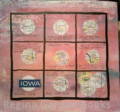
I had extra room in my journal after mounting previously posted grids. I decided to make a grid directly on the painted page of my journal. First I divided the page using Michelle Ward's excellent instructions found on the GPP Crusade post. I painted over the lines with acrylic ink.
This time I grabbed a map from my ephemera stash and punched circles featuring places in Iowa that are significant to me (where I was born, lived, schooled, art shows). After adhering the circles to the grid, I added a bit of journaling.


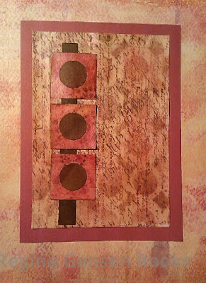
This was created on cardstock and I used squares left over from my first grid project. I decided to keep the grid minimal and set it up as an abstract art piece. Then I mounted the artwork in my journal.
Making grids could become addictive!

Tuesday, June 29, 2010

Liquitex Acrylic Ink Landscape


Last week I was inspired to paint something for my wonderful husband as his birthday gift. The scene was inspired by photos I shot at a local park, but it came mostly from my imagination.

Earlier in that day I listened to water colorist, Sterling Edwards on a webinar. That influenced my decision to paint a landscape with water color techniques. I have been experimenting with Liquitex Acrylic Inks and decided to use them. I also used a bit of Golden Fluid Acrylic Titatium White since I don't have white ink.

The white paint was used to make tints for the highlights. The majority of white on the painting is the white paper. Leaving the whites unpainted was one of the techniques that Sterling Edwards talked about. It was a good reminder for me since I don't usually remember to do that.

Before framing the painting, I went to Staples and got a half-scale copy made on photographic paper. I used the print to make Hubby's birthday card. Happily, he was thrilled with both. The painting went right up on the wall. Need I say more.

Friday, June 25, 2010

GPP Crusade No. 41: Grid Lock

Look what can be done with monoprinted and stamped card stock!

Paper was monoprinted for a previous crusade. I added the text, butterflies and flowers with stamps using metallic ink and distress ink. A spritz of water blurred the distress ink.

Detail of the stamped paper.

"Tiles" were formed with square punch and adhered to white card stock.

Another monoprint that was stamped with text and circle patterns using distress inks.

Close up of tiled paper.

This paper mosaic was used to decorate a Fathers' Day card.

Once again the creative genius of Michelle Ward has resulted in a fun challenge. Go to the crusade page for Michelle's instructions.
You should really try this. It's lots of fun. I have ideas for more of these adding more layers with some of my monoprinted tissue.


Saturday, June 5, 2010

Experiments & Faces

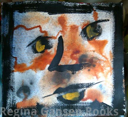
This is what happens when I experiment with no expectations...
I've been reading a book, DYNAMIC ACRYLICS by Soraya French. The author likes to use acrylic ink, often as the underpainting. I picked up a bottle of Liquitex Burnt Sienna Acrylic Ink. There's a dropper built into the cap. Wonderful. I applied the ink with the dropper on watercolor paper - dry, wet into wet, sprayed with water, alcohol, etc. Then I added Liquitex Soft Body paint - Ultramarine. More ink. Then I decided I needed a little black. That's when I saw a face. So I dipped a brush into the jar of black soft body paint & laid calligraphic strokes on the paper to bring out the face I "saw". I came back to the page later & decided it needed a bit of highlight, so I added a few strokes of yellow ochre. Then I bordered the page with strokes of black.
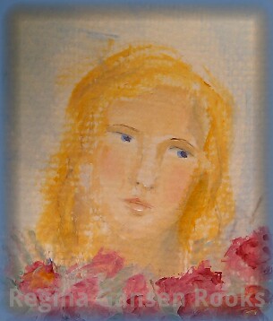
Another day, another experiment. I've been learning to paint faces. In Sharon Tomlinson's on-line class, we used Folk Art craft paints which has a nice generic skintone color. But Sharon also showed us an easy mix to create flesh tones.
This week I got out my set of Golden OPEN Acrylic paint to experiment with creating flesh tones. I was very happy with the results that came from mixing titatium white, yellow ochre, alizarin crimson and cobalt blue. Ultramarine blue also works, but has a higher tinting strength than cobalt blue, so be careful to not add too much!
Well, I had the paint mixtures on my palette and dabs of the color recorded in my paint reference journal... so how about making a face. I had about 20 minutes available, so I grabbed a miniature watercolor tablet (3.5 x 4.75 inches), quickly sketched an outline & features, then applied paint with a 3/8 inch angular flat brush.
Have you ever used Golden OPEN Paints? They are luscious & creamy & so blendable!

This little study was painted very loosely. ALL of it was painted with that relatively large brush. The angle makes it possible to paint the smallest details when using a superb paint like Golden OPEN. (No, I am not getting any reimbursement for all this gushing.)
I definitely will be using this paint for more faces.

One last thing. If you want to take a fun on-line class, sign up with Sharon Tomlinson. She gives great feedback and is really fun. Sharon is offering a new class that will start this month using non-traditional colors for faces. Check it out!