Playing with beads again... My sis is hosting an open house featuring my jewelry creations this coming weekend, and I'm adding a few jewelry items to my inventory.
When I don't know where to start, I just browse through my bead inventory. Mixes of Czech glass beads drew my attention and these colors are perfect for spring and summer.
Pictured above are eye glass lanyards, but they can be converted to a badge lanyard if desired. I also assembled some memory wire bracelets from the same mixes. Memory wire is so easy to wear, but a very time consuming product to string.
Lots more to do... Thanks for looking.
Tuesday, April 30, 2013
Tuesday, March 19, 2013
The Cry of My Heart
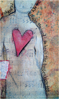
This page evolved over several days. Following the prompts by Amanda Jolley on her Joy Journal Project for March, I started with some quiet time. Just because it looks like I'm not doing anything, there is usually much going on inside. Purposely quieting myself helped me realize that I distract or mask my chronic physical pain with many distractions. Music, reading, tv, games on my Kindle Fire, etc.
There is other pain too. We all have it. I poured out my heart when I came to my journal pages, writing with a red pen. I tested the ink to see if it would bleed when wet. It did. But there is a strong ghost of that written purge lingering under the layers I added.
 The writing sat on that page. Just for my eyes. I followed Amanda's suggestions to add spatters of paint and veils of gesso. Another day goes by. I'm not even thinking about the journal and I remember the words of a worship song - "It is the cry of my heart to follow You." That is what I had poured out. The cry of my heart. Another day I came across a Bible verse that put things in perspective and pointing me to the Hope of my heart. Now I had the heart to continue with the page. I added glazes of sheer paint and sprayed thinned acrylic ink. A bleeding heart was drawn with the dropper from a bottle of Liquitex Acrylic Ink. Scrapbook papers were used for the collage. I glazed layers of paint on a strip, then stamped the words with StazOn Ink. After tearing the edges, I distressed them with pastel pencils. The silhouette started as a tracing from an illustration. I transferred it to scrapbook paper and cut it out.
 |
| Joy Journal March 2013 |
There is other pain too. We all have it. I poured out my heart when I came to my journal pages, writing with a red pen. I tested the ink to see if it would bleed when wet. It did. But there is a strong ghost of that written purge lingering under the layers I added.
 The writing sat on that page. Just for my eyes. I followed Amanda's suggestions to add spatters of paint and veils of gesso. Another day goes by. I'm not even thinking about the journal and I remember the words of a worship song - "It is the cry of my heart to follow You." That is what I had poured out. The cry of my heart. Another day I came across a Bible verse that put things in perspective and pointing me to the Hope of my heart. Now I had the heart to continue with the page. I added glazes of sheer paint and sprayed thinned acrylic ink. A bleeding heart was drawn with the dropper from a bottle of Liquitex Acrylic Ink. Scrapbook papers were used for the collage. I glazed layers of paint on a strip, then stamped the words with StazOn Ink. After tearing the edges, I distressed them with pastel pencils. The silhouette started as a tracing from an illustration. I transferred it to scrapbook paper and cut it out.
Then I added Inka Gold Metallic Rub (a bees wax product). It can be quite sheer but adds a great shine. On the bottom image, the figure looks almost solid in color, but that is the effect of the metallic reflection from that angle.
The page was finished with a few more touches with the pastel pencils, some journaling around the figure using a Pitt Pen, and a bit more sprayed ink.
Saturday, March 2, 2013
The Eyes Have It
 |
| Beyond Beyond Assignment - From Above |
In Beyond Beyond we were encouraged to take shots from above. I tried a few things unsuccessfully. The subjects were really flat and boring shot this way. I decided to try a still life of some of my eye makeup. The round brushes and tubes would roll away from their placement on my smooth surface. I think putting the rumpled cloth beneath them helped save the shot. Not only did it stop the items from rolling, the fabric folds gave the light more places for shadows and textures.
In Photoshop Elements 4.0, I enhanced the lighting with a gradient layer and levels adjustment layer. Kim Klassen's texture layer, Cora, was applied twice and using different blend and opacity adjustments for each layer. A text layer was added. The finishing touch was to add the frame on a separate color fill layer which was also adjusted for blend and opacity.
Tuesday, February 26, 2013
Ministering Angels
 |
| What a few enhancements can do for an image. |
Enhancements include the filters high pass and gaussian blur as well as layer adjustments to levels, saturation, gradient and color fills. This was topped by Kim's texture layer Mary from the Downton Collection.
 |
| Cropped only, no enhancements. |
Using the gaussian blur helped push the background back and when I erased the angel from the blur layer exposing the focused layer, I gave it the emphasis I desired. (I'm still working in PSE 4, an old version of PS Elements that doesn't have the masking capabilities that new versions have which is why I literally erased the blurred angel.)
There were ten layers when I completed this image.
A few years ago Mom gave me this garden angel to thank me for helping when she had health issues. I placed it by roses in my garden. One of my sisters and I had a great day selecting the roses. A pretty yellow variety was to remember my Grandma by, but the rabbits and Japanese beetles have taken their toll on it. I think last summer's drought finished it off. Obviously, this angel doesn't have mystical powers to ward off enemies in my garden, including the dandelions popping up around it... But it reminds me of Mom and how when we give of our self to others, we may seem like an angel to them. The Bible tells us that God sends angels as ministering spirits to help us in time of need.
Earlier today I finished a novel on my Kindle called "Not A Sparrow Falls" by Linda Nichols which is a free download from Amazon at the time of this posting. I wasn't sure I liked it when I was in the first couple of chapters, but I decided to keep going. Soon I was hooked. There are references in the book that go with this image very well. If you have a Kindle, you should check it out.
Labels:
Bible,
faith,
garden,
Kim,
photography,
photoshop elements,
TextureTuesday
Saturday, February 23, 2013
Comforted in Sorrow
 |
| Joy Journal February 2013: The Art of Appreciation |
I'm working on loose smooth bristol pages I prepared to bind once my journal is completed. I started by writing my thoughts with pencil on the page.
 |
| A few swipes of watercolor paint washed over my journaling. |
 |
| Used tea bags applied to page with matte medium. |
The journal challenge asked us to collage on our page for texture and variety. I like using tea bags because they are translucent and stained.
After the page dried, I added a bit more teal and rusty colored paint using Golden Fluid Acrylics.
 |
| Wall paper hearts, a tea bag label and doodled shape collaged on page. |
 |
| You never know when your doodles will come in handy! |
While doodling rows of heart chains I started to image the cup shape. I tore it out to collage on the page. The string of the tea label is attached under the cup, but the rest of it is loose.
 |
| Caran d'Ache crayons used to color the cup and add handle. |
Faber Castell Pitt markers were also used for shading and the bit of journaling I added under the cup.
When working on a sealed surface, you can easily blend them by rubbing with your finger.
The white lettering was done with a Sakura Permopaque marker and then outlined with a FC Pitt marker. The red heart was done with a Sakura Glaze Pen.
 |
| The finished page. |
But the rest of the story is for another day and another post.
Friday, February 22, 2013
Celebrating 300th Post with Animation
Woo HOO! It's my 300th post and just in time, I learned a nifty editing technique from Kim Klassen and a Beyond Layers lesson. Now I know how to make an animated image. It's a visual party.
The pictures are from my February journal page inspired by Amanda Jolley and her Joy Journal Project. I'll write a separate post with more details on the page techniques.
I think I'll celebrate with a nice hot cup of tea sweeted with honey. Now which tea shall I select?
The pictures are from my February journal page inspired by Amanda Jolley and her Joy Journal Project. I'll write a separate post with more details on the page techniques.
I think I'll celebrate with a nice hot cup of tea sweeted with honey. Now which tea shall I select?
Thursday, February 7, 2013
Revisiting Art Journals and Clipping Layers
Tonight I learned how to make a template with PS Elements which I used to assemble this collage. The template was created with layers and shapes and clipping layers together. I don't know why it took me so long to get to the point of figuring out how to do this, but I know I will find the technique very useful. It's really not hard.
Well, once I made the template, what was I to put in the blanks? A quick scan through image files took me to folders with journal shots. I chose xo and heart themed pages for this collage. Next I added a subtle texture layer by Kim Klassen called Peony. Finally, the quote was added.
I might paraphrase this quote to say, "At the touch of love everyone becomes an artist."
 |
| The template before adding images. |
I might paraphrase this quote to say, "At the touch of love everyone becomes an artist."
Subscribe to:
Posts (Atom)


