Showing posts with label mixed media. Show all posts

Tuesday, March 19, 2013

The Cry of My Heart


Joy Journal March 2013
 This page evolved over several days. Following the prompts by Amanda Jolley on her Joy Journal Project for March, I started with some quiet time.  Just because it looks like I'm not doing anything, there is usually much going on inside. Purposely quieting myself helped me realize that I distract or mask my chronic physical pain with many distractions.  Music, reading, tv, games on my Kindle Fire, etc.
There is other pain too. We all have it.  I poured out my heart when I came to my journal pages, writing with a red pen.  I tested the ink to see if it would bleed when wet.  It did.  But there is a strong ghost of that written purge lingering under the layers I added.
The writing sat on that page.  Just for my eyes. I followed Amanda's suggestions to add spatters of paint and veils of gesso.  Another day goes by.  I'm not even thinking about the journal and I remember the words of a worship song - "It is the cry of my heart to follow You."  That is what I had poured out.  The cry of my heart.   Another day I came across a Bible verse that put things in perspective and pointing me to the Hope of my heart.    Now I had the heart to continue with the page.  I added glazes of sheer paint and sprayed thinned acrylic ink.  A bleeding heart was drawn with the dropper from a bottle of Liquitex Acrylic Ink.   Scrapbook papers were used for the collage. I glazed layers of paint on a strip, then stamped the words with StazOn Ink.  After tearing the edges, I distressed them with pastel pencils.  The silhouette started as a tracing from an illustration.  I transferred it to scrapbook paper and cut it out.  

Then I added Inka Gold Metallic Rub (a bees wax product). It can be quite sheer but adds a great shine. On the bottom image, the figure looks almost solid in color, but that is the effect of the metallic reflection from that angle.
The page was finished with a few more touches with the pastel pencils, some journaling around the figure using a Pitt Pen, and a bit more sprayed ink.


Saturday, February 23, 2013

Comforted in Sorrow

Joy Journal February 2013: The Art of Appreciation
 In my last post I introduced you to my journal page titled "Comfort".  Our Joy Journal assignment was to document a moment from this year for which we were grateful. Something like that can be hard to capture on a page, especially when it is personal.

I'm working on loose smooth bristol pages I prepared to bind once my journal is completed.  I started by writing my thoughts with pencil on the page.

A few swipes of watercolor paint washed over my journaling.
 One of my uncles passed away very suddenly last month. Then I got sick and wasn't able to go to the funeral.  When it really hit me that I wasn't going to be well enough to attend the services, I was so very sad.  My sweet husband was there to comfort me.

Used tea bags applied to page with matte medium.
 I can't tell you how much tea I drank last month.  I started with a basket overflowing with a variety of teas. Now there is a lot of space in the basket. ;-)
The journal challenge asked us to collage on our page for texture and variety.  I like using tea bags because they are translucent and stained.
After the page dried, I added a bit more teal and rusty colored paint using Golden Fluid Acrylics.

Wall paper hearts, a tea bag label and doodled shape collaged on page.
 I have old wall paper books that I got for free at the paint store a few years ago.  They are good for inspiring textures and shapes.  Sometimes I even remember to use them for collage as I did for the hearts on the page.  Hearts go with comfort, right?

You never know when your doodles will come in handy!
 Since I drank so much tea during my illness, I thought a cup of tea would be a good symbol for the page.  (Bigelow Vanilla Chai is delicious with honey and milk.)
While doodling rows of heart chains I started to image the cup shape.  I tore it out to collage on the page.  The string of the tea label is attached under the cup, but the rest of it is loose.

Caran d'Ache crayons used to color the cup and add handle.
 The Caran d'Ache crayons are water soluble.  I blended and sealed them with acrylic matte medium. I also used them to add shadowing around the hearts to help them merge into the background.

Faber Castell Pitt markers were also used for shading and the bit of journaling I added under the cup.
When working on a sealed surface, you can easily blend them by rubbing with your finger.
The white lettering was done with a Sakura Permopaque marker and then outlined with a FC Pitt marker.  The red heart was done with a Sakura Glaze Pen.
The finished page.
I wish I had done more pages that remind me of special moments which can easily pass by and be taken for granted.  Today I was standing at the kitchen sink really enjoying my first cup of water for the day. The sun was sparking like diamonds on the crisp fresh snow.  It occurred to me that I should write about it, so I did.  I grabbed a fresh page for my journal and now that moment is documented. I even started adding color.
But the rest of the story is for another day and another post.

Thursday, January 31, 2013

Zing Zing Zing

I'm back to blogging and I hope to make this a regular practice again.  This quick post features a digitally altered image of my new journal cover.

I decided to join Amanda Jolley's Joy Journal Project to help me get back to art journaling.  Our prompt was to choose a word for 2013 with further instructions.  In December I was watching episodes of the BBC program "As Time Goes By".  One of the main characters sighed that the ZING had gone out of his life.  I love the sound of that word.  ZING
I had a much more serious word in mind - STEADFAST, but ZING wouldn't let go.

This journal has bristol board pages and recycled cereal box covers.  I will bind them with my Zutter.  I may also include other paper in the journal since I'm keeping the pages loose for now.

Pieces of scrapbooking papers were adhered to cereal box cut to size.  I added smears of gesso, and stamping.  Die cut flowers were added.  I will probably add doodling to the covers as well as time goes by.  The insides of the covers are the plain side of the boxes which have some gesso and glazes of color on them with a finish of matte medium.  I can easily embellish them in a variety of ways as time goes by.

I'm also planning to get back to digital image processing and have signed up for more of Kim Klassen's inspiration with Beyond Beyond.  This was the first processing I've done with PSE for a few months and I can't believe how much I've forgotten.  I have several weeks of lessons to pour though to get caught up.  This image was altered with a bit of texture layering and blending modes along with some added text.

Thursday, July 12, 2012

Mixed Media ATC's with Dragonflies


I've created a series of ATC's following most of the same techniques I explained in my last post.  This is a scan of one of them.
If you're in the area, I hope you'll stop by my tent this Sunday at the Linn Creek Art Fest in Marshalltown.

Tuesday, July 10, 2012

Dragonflies will be at Linn Creek Art Fest 2012


Here's a sneak peak at mixed media art I've been working on.  I'll have a booth at the Linn Creek Art Festival in Marshalltown this coming Sunday, July 15, 2012 from 10 - 4.  This is a fun art festival with plenty to entertain the whole family in addition to the beautiful art you can see.

In addition to mixed media art, I will have acrylic paintings and jewelry.

This art piece was started on acrylic paper which is really just a heavy water media paper.  I think it has a different sizing than regular water color paper.  After applying washes of acrylic paint and allowing the paint to dry, I added visual texture with an acrylic transfer. 

To make an acrylic transfer-
Choose a laser or toner copy of clip art (I used copy of a floral design from a Dover royalty free book.) and adhere it face down to the art surface using matte or gloss gel medium.  Rub the paper to make sure there are no air bubbles, but be careful to not get any medium onto the top of the paper.  Allow the medium to thoroughly dry which can take several hours to over night, especially in humid conditions.
Now you will wet the paper you adhered to your art. 

A damp cloth works well to help keep the paper moist as the paper gets softened.  When it starts to look translucent, rub the paper and it will peel or curl up from the surface, leaving the toner image behind on your art.  If your image is coming up as you rub, you didn't adhere it with enough medium or it wasn't thoroughly dry.  Occasionally, you may be rubbing too hard.  I find Golden gel medium has very consistent results.  I've used Liquitex, too, but its gel is not as creamy as Golden and is trickier to apply evenly for this type of application.

Keep rubbing away the paper until the milky appearance is gone.  As the surface dries, you may find that you haven't removed as much paper as you thought!  Just keep wetting the surface and rub away.

I added more layers of matte medium and paint over the transfer.  I also used Caran D'Ache water soluble crayons, Inktense pencils and water soluble graphite to enhance the surface.  The transfer was very bold and I wanted to push it way back so my dragonfly clipping and text could be the stars.  The background was still a bit intense for my purposes, so I stenciled the vines with gesso and added more color glazes on it.  I also used a bit of interference paint in one of the glaze layers.
In person, the result is reminiscent of encaustic. 

The dragonfly is my personal clip art.  Last fall I painted a set of dragon flies on Tim Holtz Grunge Paper for a client.  Before delivering them, I scanned them to use for clip art in future projects.  After this collaged dragonfly dried on the surface, I embellished it with Sakura gel pens and outlined it with water soluble graphite.

The text was salvaged from an old music book that I rescued from a friend's discards.

I scanned the finished art and added the border effect to the digital image.

Now it's time to finish a bit more art...

Saturday, February 25, 2012

GPP Crusade No. 60: I Love...

It's been a few months since I participated in a GPP Street Team Crusade.  Besides following Michelle Ward's prompts for the challenge, there is the fun of reading the blogs of the other participants.   I've made some wonderful friends through the comments and emails that have been shared through this group.  But, sometimes life has other priorities and I needed to step back... and I read today that there will be only one more crusade after this.  I'm SO glad that I'm jumping back in right now because it gives me an opportunity to say it loud from here:
 I love you Michelle Ward!
Mixed media with digital text.

I created a two-sided page on Strathmore Mixed Media Paper.  This paper is great!  It's smooth surface made writing I Corinthians 13 [the Love Chapter] with a Sharpie pen a pleasure.  Next I used a favorite technique gleaned from an earlier crusade - gesso resist.  Using a heart stencil, I applied tinted gesso with a sponge roller.
After the gesso dried, I used a limited color palette of transparent raw sienna, quinacridone magenta and phthalo blue, and transparent mixing white (zinc white).  Since the paint was thick (Liquitex from tubes), I thinned the paint with matte medium and water.  I wanted rich pigments and yet retain tooth to the paper for subsequent layers.  Using the same paints, flowers and hearts were stencilled on the page.  Circles were made using bottle caps for stamps.

Page without the digital journaling.
 Now I let this set for a few days before deciding what to do next.  Using a white Sharpie poster paint marker and Inktense pencils in similar colors to the paint, I brought out some of the shapes and added a bit of doodling.  Love was written with the Sharpie marker and shaded with the Inktense pencils.  A bit of additional doodling was added with a Sharpie pen.  I can go back to this page and add more doodling, but I decided to stop now and scan it so I could add a digital message.  When I read today that Michelle is retiring the crusade after next month, I knew what I had to say.
Here's a wink to you, Michelle!
As I stated earlier, I painted both sides of the paper.  One edge is deckled (paper torn against a deckling ruler).  I folded the page not quite in half to leave space for adding a binding later with my Zutter Bind-It-All.  My Martha Steward scoring board and a ruler helped me get a clean fold on this heavy paper.
This page used the same paints except for the transparent raw sienna.  There was no journaling on the page either.
Last night I found a face (Sharon Tomlinson, thank you) and brought it out subtly with Inktense pencils.
Inktense go on like a regular colored pencil, but when you wet the color, it intensifies and you can move it with a paint brush.  Once it dries, it is set.  I have a small set of 12, but would love more some day.
Please look into the Green Pepper Press Street Team Crusades.  They are still available for viewing and learning and doing!  Michelle has been a generous teacher and a great cheer leader.

Tuesday, October 26, 2010

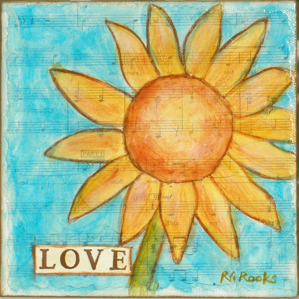
Faith Hope Love Sunflower Trio


The three paintings shown side by side.
 This is a mixed media set I created on 6x6 gallery wrapped canvases.  After preparing the canvas with sections of sheet music, I painted the sunflowers and backgrounds with acrylic paint.
Text was stamped on paper and adhered to canvas with soft gel.  Additional details were added with water soluble brown pencil that was blended and sealed with matte medium.


The paintings are for sale as a set. Cost is $90 + shipping (and sales tax to Iowa residents).

Saturday, September 11, 2010

Celebrating RGR Designs Blog Post No. 250


August 30, 2007 was the birthday of this blog.  At the time, I had considered creating a blog to help promote my jewelry creations in my Esty store, but I was intimidated by the process of setting one up.  Hubby and I had attended local art festival that summer with the intent of researching ways I could display my work at my first outdoor festival.

In July, we met Brandie Butcher Isely of Little Pieces of Art at the Marshalltown Art Fest.  She is a wonderfully sweet artist who encouraged me, and she gave me concrete advise for setting up my own blog.  I started following Brandie's blog and those of some she had highlighted on her blog.  I was astounded by the generousity and depth of sharing of the artists I discovered in Blogland.  So I launched my own blog.

Now it is three years later and I am writing my 250th post! That is an average of about 1.6 posts per week.  Whew!  I've kept to a goal of posting at least once per week.  Well.  Sort of.  There have been times when I participated with a blogger challenge of posting each day and followed through pretty well.  Then there were the times when energy is low and life is busy and no blogging. We all go through that. 

Experimentation has been a driving force for my art, but being part of the art blog community has pushed me to extend my boundaries by trying even more techniques than I would have come up on my own.  I also have a frugal streak.  These traits can cause inner conflict, but there is a way to reconcile them. 

While working on my "serious" (HA!) art, there is alway extra paint left on the brush, palette, or tool.  One way to use it up is by applying the paint to a sheet of art paper.  I recently created the "master" sheet pictured below.
Once the page was mostly covered with paint, I added layers of stenciling and monoprinting to add texture to the page.  Next I cut the paper to the standard ATC size (2.5 x 3.5 inches).  Then I looked at each card as a separate art piece and embellished it.


Sampling of ATCs
Stamps, stencils, ephemera, gesso, pens, ink and paint were used to embellish the cards.

To celebrate my 250th post, I will be giving away some of my ATCs.  Please comment by 9/23/10 to be put in a drawing for the give away.  Be sure your comment has a way for me to contact you if you are a winner!


Being a blogger has been a journey that has helped me grow as an artist. Communicating with other artists across the globe has been a thrill.  I am SO GRATEFUL for all the encouragement that comes from your comments. Thank you!

Saturday, July 24, 2010

GPP Crusade No. 42: Strip Ease

Visit the official crusade blog for Michelle Ward's instructions for this month's challenge. I decided to use some left-overs to create my journal page.


It was fun adding layers to the already painted page. It didn't take long to complete.
While writing on the page with a Sakura Souffle Pen, I enjoyed the contrast of white against the saturated colors on the page.
The tissue paper strips aren't obvious as strips, but they added a lot to this page. When I added the bits of orange monoprints, I started to see the hint of flowers. So I took a small paint brush and added the outlines with Liquitex Acrylic Ink.

This page encouraged me to add layers to more of my painted pages.

Thursday, May 27, 2010

GPP Crusade No. 40 - Part 2 (XOXOXOXO)

Since I ended up framing my first crusade project, I needed to do another one for my crusade journal. This is a close up showing some of the subtle texture on the page. (Click on the photo to seem the whole image.)

This is on Fabriano cold press watercolor paper. I applied layers of Folk Art Paint in yellow/gold, burgundy and rust. After stamping xoxo with chalk ink, I stenciled the xo pattern with black paint. All these applications were done with a small sponge roller - the same type you find in the paint section of your local hardware or home improvement store.


Next I prepared the large XO by printing the letters on tissue paper using metallic copper paint. It dried quickly & I "painted" tear lines with water around the letters. (You can control your tears by applying water with a damp brush.) After brushing Golden Matte Soft Gel to the surface, I applied the tissue X & O. When dry, DecoArt One Step Crackle was added to the surface. Several hours later I decided to add more contrast by drawing around the large X & O with a black Stabilo pencil. Next I blurred the line and set the pencil with fluid acrylic medium.

To take down the shine, I added a layer of matte medium to the entire piece.


I used a set of large craft foam letters to stamp the X & O. I picked them up in the children's craft section at Hobby Lobby.

Monday, May 10, 2010

Believe


Face2Believe.jpg
Originally uploaded by rgrdesigns
This is another mixed media project from All NorahS Art Faces on-line class that I finished this weekend. "Believe" is on a 4" x 4" canvas. A few minor adjustments to her face and hair were added since the previous post. Napkin and tissue were collaged on with Golden Matte Soft Gel. Using Staz-On ink, I stamped "believe" on rice paper that was colored with Ranger distress ink.

I was asked if she is based on anyone. Yes and no. There is much instruction on drawing faces that gives basic guidelines for placement and size of facial features. So, in that sense, she is "generic". However, I did refer to a photo of actress Amy Adams for the general shape of her face.

In the class, Sharon demonstrated blond hair and green eyes. I'm working my way to the brunette side. I knew that using only brown would result in flat looking eyes and hair. There are shades of gold, brown, rust and even deep burgandy in her hair.

I have two more canvases prepped for faces. Our instructions were done with Folk Art Paints which are very economical. But I'm ready to try working with Golden Open Acryllcs. My next challenge is to try mixing my own flesh tones.

Saturday, October 31, 2009

GPP Crusade No. 34

Collage of elements from my experiments on black paper.
When this Green Pepper Press challenge was announced, I was excited about the possibilities and wanted to explore ideas I have for working on black backgrounds. Earlier this summer I painted a design on black for my husband and have wanted to do more. But it's been a busy month with other priorities. I didn't know if I would get to follow through.
I decided to tear 8-1/2 x 11 sheets of black cardstock in half. Late in the evening I would spend a few minutes trying different media on the paper. It's the end of the month and I have a collection of papers to show for it. I plan to bind them into a journal.

I monoprinted and stamped white gesso on some pages. When dry, I experimented with adding color using opaque watercolor, water soluble oil pastel, and stamping. The gesso was very porous and the colors were very muted on it.

Opaque watercolor and soft pastels were worked directly on black paper with more dramatic results.

Metallic pigment markers were used on glossy black cardstock. I also used them to ink a rubber stamp which is the butterfly in the collage above. The shimmery quality of these images doesn't show up well in the photos.

I used masks and applied soft pastel to a page for dragonflies. I stamped with white chalk ink over hand-shaped masks. I scumbled white gesso around the hands to make them stand out against the page better.

These are among my favorites. I used heavy body acrylic paint - regular and metallic. Paint was applied with a brayer. The papers on the right and the left have been stamped as well. I used acrylic paint on the stamps.
I made notes with more ideas on another black page using a metallic gel pen. I bought black illustration board with the intention of cutting it into covers for the journal, but I cut pieces for new artworks instead. I have already started a new work on one of the pieces.
[I will NOT be pursuing art pieces on this black illo board because the top layer of paper began to delaminate when I put juicy washes of color on the gesso base coat.]
This was a great idea for a challenge. I learned a lot and now have a new set of inspirations to work from. I found that a few minutes spent on a consistent basis will turn into more than I could have imagined. Thanks Michelle!

Friday, June 26, 2009

Make It Your Own - GPP Crusade No. 31


I'm finally back to painting after a long break due to a full schedule. One of my first projects was to paint this small piece for my brother and his bride. I promised them a larger painting as their wedding gift. Now that I've seen their new home, I have some ideas of what to paint.
I haven't been checking out all my favorite blogs as much as usual either. I think it was good to have this break and start back to painting with less influence in my head from other artists. When I decided to make this little painting, I flipped through my visual journal for inspiration. I could really "make it my own" which is the theme for the current Green Pepper Press Crusade.

I've learned a lot from my fellow crusaders and other artists, and they have influenced my art. Through my visual journal and other art play, I discovered my love for circles and abstraction. I have learned the richness and depth that come from adding many layers. Michelle Ward has generously tutored the GPP Crusaders to take our art to new levels.

"Cherish" is mixed media on watercolor paper. I started by writing a portion of I Corinthians 13. The graphite writing is all concealed under the layers of paint, but it set the mood for the piece. I alternated dry brushing, stenciling, stamping, mono printing, etc. to build the color and depth I was looking for. I used water soluble graphite for accents. Cherish came from a page of scrapbook embellishments. The finished artwork went into a 5 x 5 inch frame.

It was a joy to be playing with paint again. I've been working on small canvases in preparation of the Linn Creek Art Fest next month. I hope to post pics very soon.

Thursday, June 4, 2009

Ames Art Walk 2009 Sneak Peak


May was a very busy month with special events and special visitors, so I've been away from this blog. Thanks to those who keep checking on me.

Tonight I will join my Tuesday night painting group, Artists of the Heart, to set up our exhibit at Chocolaterie Stam in Ames, Iowa. The annual Art Walk will be held in the downtown shopping district on Friday, June 5th from 5-8 p.m. This is a great venue to hold an open house because the atmosphere is cozy and the treats can't be beat... gelato and European chocolate. ~swoon~

Earlier this week I took paintings to the Swinging Bridge Studio in Story City. The annual Scandinavian Days festival is being held all weekend in Story City. I plan on spending some time at the studio and meeting fellow art-lovers.

The above image is cropped from my mixed media painting "Remember". I'm showing it at Stam. You can read more about it here.

I just finished reading "A Three Dog Life, A Memoir" by Abigail Thomas. Memory is a major theme in this book. Abigail's husband suffered a major brain injury when he was struck by a car one evening while out walking the dog. His skull was crushed and part of his brain was destroyed. He lost his short term memory. You would think this was a depressing read. Yes, there were aspects that were extremely sad, but Abigail does not wallow in sorrow. She is a woman of courage, loyalty and strength. The book stimulated a lot of thought for me.
I thought of the journey my Mom took with Dad as he was taken away gradually by Alzheimer's Disease. I wonder what lies in the future for my family. Where will AD show up again?
I am so grateful for the hope I find in Scripture. When fears nip at my heals, I remember Who will never forget me and find my comfort in Him.

Friday, March 13, 2009

WIP and Book Give Away

Yesterday I read a sweet story and was inspired by a quote in it. Last night I started this piece based on that inspiration. I'll reveal more when it's complete. I'm posting this much now because my technique is based on one I learned in Susan Tuttle's book, Exhibition 36. You can buy it here.It's a wonderful book because it has a great balance of inspiration plus detailed instructions. That's my favorite kind of book. Be sure to visit Susan's blog so see how you can enter the GIVE AWAY.

Thursday, February 5, 2009

Remember - "He Knows My Name"

Misty Mawn prompted us to journal/make art inspired by a song. For some time I have wanted to do something in response to Tommy Walker's song "He Knows My Name". I first heard the song while my Dad was still alive, but Alzheimer's Disease had stolen our names from his memory. The song was and is a comfort to me and reminds me of the promises of God, our Father & Maker, who will ALWAYS know my name. He knows me. He knew my Dad.

So I sketched a woman who is feeling sad, but she is not desolate because she remembers these words when she hears these words.
I collaged some scrapbook & found papers onto a gessoed illustration board. Some of the paper bubbled & so I distressed the surface by sanding off the bubbles. There are arms reaching down and you can see part of one of the hands if you look closely. I sketched the woman with watersoluble graphite & painted her with a combination of acrylic & gesso. Stenciled motifs were also done with acrylic paint. Chalk pastel was used for accents. I stamped the word remember with chalk ink on paper I had distressed.
Here's Tommy Walker's song.

Sunday, February 1, 2009

Art Journal Day 31 - Playful

A little tidying up produced a small stack of tags I'd saved because I found them interesting in one way or another. I saw this "Playful" tag and knew it would be my next journal page's theme.
I'm interested in exploring various versions of this scroll tree that I developed after being inspired by Pam Carriker's video using Pitt Pens earlier in the month.
The base is one that was prepped with left over paint from my palette. You may have noticed there's a lot of blue in my work this week. Instead of using white paint, I've been using gesso. It makes the page toothier for this mixed media work. First I stamped the flock of birds with pigment ink. I added some colored pencil to beef up the color.
I decided to try colored pencils for the tree. In this case I used Col-erase pencils and I really liked how they went down on this surface.
The tag was altered with distress inks and applied to the page. Lastly I used graphite to write a few verbs along the tree that describe where this month long journaling journey has taken me.

A couple nights ago I painted the cover of my journal. This is a standard 5.5 x 8.5 Strathmore sketch book. At the beginning of the month I prepped the cover with gesso and a layer of rice paper. More gesso was added. When we did our pink page, I added a bit to the cover. But I just didn't know what to put on it yet. Sometime in this past week or so I realized what a wonderful journey this has been for me. The consistent practice has led me to developing some themes. I've found new ways to express myself. I surprised myself a few times. I've made new friends for which I'm grateful.
So my journal is titled "Journey" and I chose a motif that I'm having fun with trying out in different media. I may add more words to the cover, but I'm not sure.Sometimes I forget what a treat traditional watercolor is. Sure, it can be very challenging and it takes patience. I enjoy the quietness of the process as compared to how I work in traditional acrylic.
So, before I close - how about a little give-away? To celebrate the end of January Art Journal month, I will give away a postcard sized original.
Here's what you need to do leave a comment stating what you think my "playful" tag came from. If you are correct, I'll put your name in the hat twice.
Comments for the give-away will be open until midnight CST on Wed. Feb. 4th. NOW CLOSED. I WILL BE IN TOUCH. The Playful label came off a Cacique bra. Now you know.

Wednesday, January 21, 2009

Art Journal Day 19 - Embellish

Misty challenged us to use fabric and embellishments for this journal entry. This has been the most challenging page for me so far this month. It could be because I was very tired. But I think it has more to do with the brain fog that comes over me when attempting to get very embellished. To help me get started, I flipped through a wallpaper sample book that I picked up for free at the local paint & decorating store. This book had swatches of coordinating fabric for some of the collections. I chose a fairly neutral paisley printed fabric and cut out a section of the coordinating wallpaper, too. I'm drawn to paisley designs and this gave me a theme for the spread. I altered the fabric with blue paint. I added walnut ink to both the wallpaper and the fabric. They were both glued into my journal that had been prepped with gesso. The wallpaper was a nuisance in that it resisted most things I tried on it. I finally got some chalk ink & Stazon ink stamped images to stay on it. I loosely traced some of the design lines on the fabric with a Pitt Pen. The 2nd page of the spread has layers of paint, gesso, walnut ink, and stamped images. I adhered a candy label, drew an eye and journaled my thoughts. Once everything was dry, I added glitter glue and a couple of sequin flowers.
I like the color scheme that I developed. I also like the depth of the background on the 2nd page of the spread. But I'm not impressed with the grunginess that I developed. To me, the glitter is really odd against that setting.