Showing posts with label Golden Acrylic. Show all posts

Saturday, February 23, 2013

Comforted in Sorrow

Joy Journal February 2013: The Art of Appreciation
 In my last post I introduced you to my journal page titled "Comfort".  Our Joy Journal assignment was to document a moment from this year for which we were grateful. Something like that can be hard to capture on a page, especially when it is personal.

I'm working on loose smooth bristol pages I prepared to bind once my journal is completed.  I started by writing my thoughts with pencil on the page.

A few swipes of watercolor paint washed over my journaling.
 One of my uncles passed away very suddenly last month. Then I got sick and wasn't able to go to the funeral.  When it really hit me that I wasn't going to be well enough to attend the services, I was so very sad.  My sweet husband was there to comfort me.

Used tea bags applied to page with matte medium.
 I can't tell you how much tea I drank last month.  I started with a basket overflowing with a variety of teas. Now there is a lot of space in the basket. ;-)
The journal challenge asked us to collage on our page for texture and variety.  I like using tea bags because they are translucent and stained.
After the page dried, I added a bit more teal and rusty colored paint using Golden Fluid Acrylics.

Wall paper hearts, a tea bag label and doodled shape collaged on page.
 I have old wall paper books that I got for free at the paint store a few years ago.  They are good for inspiring textures and shapes.  Sometimes I even remember to use them for collage as I did for the hearts on the page.  Hearts go with comfort, right?

You never know when your doodles will come in handy!
 Since I drank so much tea during my illness, I thought a cup of tea would be a good symbol for the page.  (Bigelow Vanilla Chai is delicious with honey and milk.)
While doodling rows of heart chains I started to image the cup shape.  I tore it out to collage on the page.  The string of the tea label is attached under the cup, but the rest of it is loose.

Caran d'Ache crayons used to color the cup and add handle.
 The Caran d'Ache crayons are water soluble.  I blended and sealed them with acrylic matte medium. I also used them to add shadowing around the hearts to help them merge into the background.

Faber Castell Pitt markers were also used for shading and the bit of journaling I added under the cup.
When working on a sealed surface, you can easily blend them by rubbing with your finger.
The white lettering was done with a Sakura Permopaque marker and then outlined with a FC Pitt marker.  The red heart was done with a Sakura Glaze Pen.
The finished page.
I wish I had done more pages that remind me of special moments which can easily pass by and be taken for granted.  Today I was standing at the kitchen sink really enjoying my first cup of water for the day. The sun was sparking like diamonds on the crisp fresh snow.  It occurred to me that I should write about it, so I did.  I grabbed a fresh page for my journal and now that moment is documented. I even started adding color.
But the rest of the story is for another day and another post.

Tuesday, July 10, 2012

Dragonflies will be at Linn Creek Art Fest 2012


Here's a sneak peak at mixed media art I've been working on.  I'll have a booth at the Linn Creek Art Festival in Marshalltown this coming Sunday, July 15, 2012 from 10 - 4.  This is a fun art festival with plenty to entertain the whole family in addition to the beautiful art you can see.

In addition to mixed media art, I will have acrylic paintings and jewelry.

This art piece was started on acrylic paper which is really just a heavy water media paper.  I think it has a different sizing than regular water color paper.  After applying washes of acrylic paint and allowing the paint to dry, I added visual texture with an acrylic transfer. 

To make an acrylic transfer-
Choose a laser or toner copy of clip art (I used copy of a floral design from a Dover royalty free book.) and adhere it face down to the art surface using matte or gloss gel medium.  Rub the paper to make sure there are no air bubbles, but be careful to not get any medium onto the top of the paper.  Allow the medium to thoroughly dry which can take several hours to over night, especially in humid conditions.
Now you will wet the paper you adhered to your art. 

A damp cloth works well to help keep the paper moist as the paper gets softened.  When it starts to look translucent, rub the paper and it will peel or curl up from the surface, leaving the toner image behind on your art.  If your image is coming up as you rub, you didn't adhere it with enough medium or it wasn't thoroughly dry.  Occasionally, you may be rubbing too hard.  I find Golden gel medium has very consistent results.  I've used Liquitex, too, but its gel is not as creamy as Golden and is trickier to apply evenly for this type of application.

Keep rubbing away the paper until the milky appearance is gone.  As the surface dries, you may find that you haven't removed as much paper as you thought!  Just keep wetting the surface and rub away.

I added more layers of matte medium and paint over the transfer.  I also used Caran D'Ache water soluble crayons, Inktense pencils and water soluble graphite to enhance the surface.  The transfer was very bold and I wanted to push it way back so my dragonfly clipping and text could be the stars.  The background was still a bit intense for my purposes, so I stenciled the vines with gesso and added more color glazes on it.  I also used a bit of interference paint in one of the glaze layers.
In person, the result is reminiscent of encaustic. 

The dragonfly is my personal clip art.  Last fall I painted a set of dragon flies on Tim Holtz Grunge Paper for a client.  Before delivering them, I scanned them to use for clip art in future projects.  After this collaged dragonfly dried on the surface, I embellished it with Sakura gel pens and outlined it with water soluble graphite.

The text was salvaged from an old music book that I rescued from a friend's discards.

I scanned the finished art and added the border effect to the digital image.

Now it's time to finish a bit more art...

Monday, April 30, 2012

GPP Crusade 61 - Restraining Order

This is a simple journal page for the last GPP Street Team Crusade - Restraining Order.  The challenge was to create a simple journal page that we didn't feel compelled to cover with journaling or other details.   This page started with a bit of gesso stenciled on.  The paint was scrubbed and stenciled on with leftovers from a book project.  I poured out a bit of Golden fluid acrylic for an illustration I painted and I couldn't waste those few precious drops!  That's when I started doodling the paint on the page using a pointed calligraphy nib.


This bit of ephemera happened to be on my art table.  It came from a fortune cookie.  Do something daring.  OK - I'll post this strange for me page from my journal.  And what else can I do?

I scanned the page and converted to black and white.   What if I made a digital brush?  So I did and look what happened next....


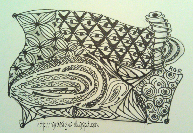
I've been all wrapped up in patterns and repetition which is what I think inspired the digital print I created.  Following are a couple Zentangles I drew.  Have you tried it yet?  It's fun and relaxing and very portable.


This is one of my favorites - probably because of the organic lines in it. 
If you have been a follower of the GPP Crusades, you know this is the last for now.  I had my page done several weeks ago, but haven't had an opportunity to post due to busy circumstances with family.  I'll always be grateful to Michelle Ward for all her generous tutorials and challenges from the past years.  You can still go back to see the crusades and do them on your own.  Go ahead.  I dare you!

Saturday, September 17, 2011

GPP Crusade No. 54: Mind Games -Inspired by the Iowa State Fair

I love the colors that surround me at the Iowa State Fair.  When Michelle Ward posted the August Challenge, Mind Games, I knew exactly where I would find my inspiration for the challenge.  This was a perfect chance for me to do a simple study of modern vs. traditional pigments.
Be sure to go to the GPP site to read what Michelle had to say about this challenge.

Have you ever tried mixing colors and just came up with muddy colors?  You learned in school that red + blue = violet, yellow + red = orange, and yellow + blue = green.  But it's not quite that simple.  If you mix the wrong versions of these primary colors, you will not end up with the pure colors you may have desired.
Try mixing only modern (organic) pigment colors together.  You will get pure, vibrant mixtures.
Traditional (inorganic) pigments work well together, but the mixtures will be more earthy.
Golden Artists Colors has a great reference sheet you can check out here and you can print it out for your reference. Follow this link for Golden's Organic vs. Inorganic Pigment list.

Back to the fair...

I chose the vegetable competition to provide inspiration for my Traditional (Inorganic) Color Palette (Cadmium Yellow Medium, Cadmium Red Medium and Cobalt Blue).
In addition to the primary triad, I used titanium white and ivory black.
In addition to the journal pages I've shown here, I painted entire pages with variations of the mixtures that I can use as the start of future journal entries.  I digitally extracted from those pages for the inspiration collage.

As much as I love daytime at the fair, the night holds my heart.  The midway and vendor lights are exciting against the evening sky.  Last year I discovered that the RetroCamera app on my phone takes the coolest shots at night, and I'm happy to share a few of those shots here along with my painted mixtures.
 The Modern (organic) Palette was created with Yellow Light Hansa, Phthalo Blue and Quinacridone Magenta.  Titanium white was used to create tints of the mixtures. It makes these transparent colors more opaque.  If I had wanted to retain more transparency, I would have mixed them with zinc white.

I hope you enjoyed this post.  Getting all this information compiled together was important to me and it's coming late.   Come back for the September challenge.  I'm hoping to be back on schedule. ;-)

Friday, July 22, 2011

Summer Treats Palette - GPP Crusade No. 53

Virtual color palette extracted from scanned paint reference journal.
 A little scanning, Photoshop Elements, and imagination came together to come up with my Summer Treats Palette.  This month's challenge from the Green Pepper Street Team was the motivation to take a new look at my paint reference journal.  I use spiral bound watercolor paper tablets to develop palettes for many of my paintings.  I like to use a limited number of paints from the tube and develop a range of shades and tints so my paints will have unity.  This is one example of how I may proceed.
Scanned paint reference journal page.
These are smears of acrylic paint - Liquitex and Golden brands - that were applied to the page with palette knives.  Some colors are pure from the tube and others are blends.  I also added titanium white to some of the blends.  I write notes around the smears to help me recreate the colors.

I developed this palette last year while planning a painting for Unforgettable Art.  I used much of this palette for paintings of purple coneflowers.  Sadly, one of the paints is no longer available, so I'll need to do another version of this palette to come up with a good compromise.  Sounds like fun to me!

Be sure to visit the GPP Street Team blog to see how Michelle Ward prompted us for the challenge.  Maybe you'll be inspired to join in.  Even if you don't blog yourself, try this.  It was lots of fun.

Saturday, June 5, 2010

Experiments & Faces

This is what happens when I experiment with no expectations...
I've been reading a book, DYNAMIC ACRYLICS by Soraya French. The author likes to use acrylic ink, often as the underpainting. I picked up a bottle of Liquitex Burnt Sienna Acrylic Ink. There's a dropper built into the cap. Wonderful. I applied the ink with the dropper on watercolor paper - dry, wet into wet, sprayed with water, alcohol, etc. Then I added Liquitex Soft Body paint - Ultramarine. More ink. Then I decided I needed a little black. That's when I saw a face. So I dipped a brush into the jar of black soft body paint & laid calligraphic strokes on the paper to bring out the face I "saw". I came back to the page later & decided it needed a bit of highlight, so I added a few strokes of yellow ochre. Then I bordered the page with strokes of black.

Another day, another experiment. I've been learning to paint faces. In Sharon Tomlinson's on-line class, we used Folk Art craft paints which has a nice generic skintone color. But Sharon also showed us an easy mix to create flesh tones.
This week I got out my set of Golden OPEN Acrylic paint to experiment with creating flesh tones. I was very happy with the results that came from mixing titatium white, yellow ochre, alizarin crimson and cobalt blue. Ultramarine blue also works, but has a higher tinting strength than cobalt blue, so be careful to not add too much!
Well, I had the paint mixtures on my palette and dabs of the color recorded in my paint reference journal... so how about making a face. I had about 20 minutes available, so I grabbed a miniature watercolor tablet (3.5 x 4.75 inches), quickly sketched an outline & features, then applied paint with a 3/8 inch angular flat brush.
Have you ever used Golden OPEN Paints? They are luscious & creamy & so blendable!

This little study was painted very loosely. ALL of it was painted with that relatively large brush. The angle makes it possible to paint the smallest details when using a superb paint like Golden OPEN. (No, I am not getting any reimbursement for all this gushing.)
I definitely will be using this paint for more faces.

One last thing. If you want to take a fun on-line class, sign up with Sharon Tomlinson. She gives great feedback and is really fun. Sharon is offering a new class that will start this month using non-traditional colors for faces. Check it out!

Friday, March 19, 2010

Prairie Fire Blossoms Acrylic Painting

My latest acrylic painting is 30" x 24" inches. It's my largest painting on canvas and I haven't given it a title yet.

The inspiration is our Prairie Fire Crab Apple Tree. We'll be seeing its glorious color through these windows in about eight weeks. Since I enlarged the design so much, I projected my photograph onto the canvas and sketched some basic outlines with water soluble graphite. I decided that next time I paint this, I'll probably use a hard regular graphite pencil so I don't have to mess around with smudges in the lighter areas. (Helpful hints from more experienced painters is welcome!)

Starting with the background, I blocked in color to establish basic values. This photo is slightly out of focus and it reminds me of when I worked more with traditional transparent watercolors.
Reds and greens seem to be the most challenging colors for me to tackle. The majority of this was done with Liquitex Heavy Body paint that I thinned with matte medium. Golden Quinacridone/Nickel Azo Gold was added to my palette. It's the only "yellow".

I prefer to work with a limited palette. This is a test/reference page I created for this project. I ended up not using the cadmium hues from my trials and chose Alizarin Crimson Hue for my red. The violets were mixes of A. Crimson plus Indanthrene Blue or Prussian Blue Hue or Cobalt Blue. Both titanium white (opaque) and zinc white (translucent) were used depending on the the effect I wanted to create. The variety of blues were chosen to change the temperature of my shadows. No "tube" greens were used other than the very small amount of cobalt turquoise that was blended with Q. Gold.

This is why I love to paint. Look at all this luscious eye candy!

Tuesday, February 9, 2010

GPP Crusade No. 37: Love Letters (part 1)

X & O
A great motif for creative play...

Michelle Ward, leader extraordinaire of the Green Pepper Street Team has challenged us once again.
After you're done reading this post, why don't you go here and play along?
Let it be a Valentine to yourself!

Just a reminder, click on images to enlarge, then hit your browser's back button to return to the post.

I'm a big fan of the X & O, and have a small collection of stamps to prove it.
But the nature of the challenge is to go beyond the familiar and try something new.
What happens if I use resist ink on watercolor paper and paint an acrylic wash over it?

What happens if I make my own tools or use my fingers as stamps?

A simple triad palette inspired by Mary Todd Beam's Celebrate Your Creative Self.
Could I make an XO mask by folding paper according style?


What will happen if I use a spatter brush over my masks?

Are you going to come play with the team?

Tuesday, February 2, 2010

Copper Archipelago

How about a hint of flying over a tropical archipelago?


I love images of turquoise water. Even more, I love being in water.

Textures excite me.


Iridescent, interference and metallic paints are fun.


I am inspired by the beauty God created in this world.
These come together when I make my art.


I previously posted this painting here. More glazes of interference green and phthalo blue were added to the border and portions of the interior space. I made adjustments to the turquoise and green passages on the interior. Metallic copper had been in my plan throughout most of this project, but I had to wait for just the right time when I felt brave because there would be no turning back...
Today I used a scumbling brush and applied Golden Iridescent Copper (Fine) very sparingly. It immediately brought new life to this painting with its complementary hue.
I had been seeing a topographical map in the surface of this painting. With the addition of the copper, that allusion became more apparent to me. As I took the close-up images, the word archipelago came to me. Then I knew I had the title for this painting.
I'm not sure how I will frame it. I put a coppery brown border on the image in PS Elements.

The border area is very reflective because of the glazes of interference color. It can appear either very light or on the dark side of a medium value depending on the light source. These photos were all taken with diffused natural afternoon light coming in a south window. There was a medium covering of clouds, so I wasn't getting glare, but it wasn't gloomy dark either. I discovered that by changing the white balance on my camera to cloudy, my colors were much truer than when I had the setting on auto.
I hope this post helped you escape to beautiful places today!

Tuesday, January 26, 2010

More January Journaling and a WIP


I'll start with a couple close-ups of a WIP (work-in-progress) using acrylic paint and Liquitex fiber gel on illustration board.


I really like the way these close-ups look. But I'm not as excited about the entire piece. I have some ideas, but pondering... Continue to the bottom of this post to see the entire painting.


I've been playing with more paper tiles in my journal. These were punched from a matte stack that I bought on clearance. There are some papers that I really like, but many I don't care for at all. So I decided to try this project. By altering them and adding layers of ink, stamping and drawing, I like the way it pulls together.


I used Tim Holtz distress ink to prepare the pages of this watercolor journal. After building the background color, I stamped leaves on the page. Today I applied gesso with a tailor's wheel to make the dotted lines. I never did that before, but it works as long as the gesso is thick enough. I will be adding some journaling, but not sure what I have to say yet.


Thinking of adding some metallic copper to this. I actually like the photo better than the real life piece. It mellowed a bit in translation. Before my last painting session, the colors were more pastel and I was going to add a bit of orange for accent. But I moved away from that idea after I added so much texture and darker hues to the piece. I'll keep you posted.
And to those of you who have wondered how we are after all the ice last week... We are great. There are just a lot of twigs to pick up out of the yard. However, they are under a new blank of snow that assaulted us yesterday. No gently falling snow in that system. The finches were amazing to watch as they tried to eat from their thistle sock in the driving snow.
Thanks for all your concern!