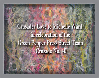
I'm a relatively new-comer to the Green Pepper Press Street Team Crusades having started at number 28. Michelle Ward has been orchestrating these challenges since the beginning. This month we celebrate
GPP Crusade No. 40: Step on the Scale. Click on the link to learn more. We haven't become a new weight loss group. Michelle challenged us to work smaller or larger than usual.
I decided to go larger than my "normal" crusade projects and used a 12x16 sheet of acrylic paper for my base. It already had smears of paint left overs on it. I layered more paint, fiber paste, and pastel on the page.
I considered cutting the page up into ATC sized cards, but I decided to try one more thing before cutting up the paper.
What if I put a unifying layer of color over the page?
I tend to avoid using black paint because of my past experience using transparent watercolors. Black can deaden a painting when using it to dull colors or make darks. However, a recent trip to the
Chicago Art Institute where we saw a special Matisse exhibit made me think about black in a new way.
More on that after I show you some of the digital tools I created that were used to compose the above image.
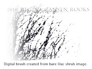
Even a very poor photo can produce treasure. I selected a portion of an image from my backyard. I liked the lacy branches against the sky. Thanks to Michelle, I knew how to make a digital brush. By adjusting the hue and opacity, I added more character to my image.
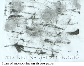
I have continued making monoprints since April's crusade. It's a great way to use up dabs of paint and I like the way it works with tissue paper. I scanned this page and converted it to brush-like layer for digital editing.
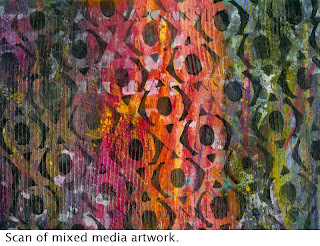
This is my finished mixed media painting. You can see the variety of colors that didn't seem to go together. Sorry, I don't have any progress shots on this. It was really ugly for a while. Really!
I added layers of distressing. Uglier. I was ready to cut it up into ATC's. Remembering Matisse's observations about black paint inspired me to stencil across the entire page using black paint. It was a risk, but I was hoping the black would illuminate the colors on the page and bring a unifying factor to the page.
I was thrilled with the results. In fact, I framed the finished page after scanning it! Then it was time to do more.
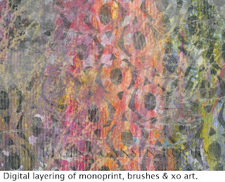
This was a challenge about scale. For me, that means
thinking big, too. I decided to push past my usual comfort zone and add layers with Photoshop Elements. Adjusting the transparency and color of my digital brushes gave me the above results.
Why don't you join the in on the fun?


