 |
| Joy Journal March 2013 |
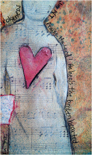
There is other pain too. We all have it. I poured out my heart when I came to my journal pages, writing with a red pen. I tested the ink to see if it would bleed when wet. It did. But there is a strong ghost of that written purge lingering under the layers I added.
 The writing sat on that page. Just for my eyes. I followed Amanda's suggestions to add spatters of paint and veils of gesso. Another day goes by. I'm not even thinking about the journal and I remember the words of a worship song - "It is the cry of my heart to follow You." That is what I had poured out. The cry of my heart. Another day I came across a Bible verse that put things in perspective and pointing me to the Hope of my heart. Now I had the heart to continue with the page. I added glazes of sheer paint and sprayed thinned acrylic ink. A bleeding heart was drawn with the dropper from a bottle of Liquitex Acrylic Ink. Scrapbook papers were used for the collage. I glazed layers of paint on a strip, then stamped the words with StazOn Ink. After tearing the edges, I distressed them with pastel pencils. The silhouette started as a tracing from an illustration. I transferred it to scrapbook paper and cut it out.
Then I added Inka Gold Metallic Rub (a bees wax product). It can be quite sheer but adds a great shine. On the bottom image, the figure looks almost solid in color, but that is the effect of the metallic reflection from that angle.
The page was finished with a few more touches with the pastel pencils, some journaling around the figure using a Pitt Pen, and a bit more sprayed ink.


