Saturday, May 29, 2010

Matisse and Black


APPLES" by HENRI MATISSE
I recently had the opportunity to visit the Chicago Art Institute. Two times! There is a special exhibit focusing on a pivotal period of Matisse's long career(1913-1917). The exhibit will be on display until June 20, 2010.

I was not very informed on Matisse's work or influences. The exhibit provided fascinating insights to both well-known and obscure art as well as his contribution to his countrymen during this unstable period of history.

My first trip to the exhibit left me inspired by this quote displayed by his painting "Gourds":
"[Matisse] began to use pure black as a color of light and not as a color of darkness."
As a watercolorist, I was taught to avoid using pure black because of its tendency to deaden a painting. In recent years, acrylic has been my primary medium and I still tend to avoid using black. But the paintings in this area of the exhibit and taking in this quote became an "AHA!" moment for me.

"Gourds" wasn't as interesting to me as "Apples". It's hard to explain my fascination with this painting. It looks so simple, but it holds my attention. I had to go back and study it again on my trip last weekend.

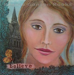
The color scheme of my last post, a journal spread for the GPP Street Team Crusade, was influenced by this painting. I love being inspired by the masters.

Thursday, May 27, 2010

GPP Crusade No. 40 - Part 2 (XOXOXOXO)

Since I ended up framing my first crusade project, I needed to do another one for my crusade journal. This is a close up showing some of the subtle texture on the page. (Click on the photo to seem the whole image.)

This is on Fabriano cold press watercolor paper. I applied layers of Folk Art Paint in yellow/gold, burgundy and rust. After stamping xoxo with chalk ink, I stenciled the xo pattern with black paint. All these applications were done with a small sponge roller - the same type you find in the paint section of your local hardware or home improvement store.


Next I prepared the large XO by printing the letters on tissue paper using metallic copper paint. It dried quickly & I "painted" tear lines with water around the letters. (You can control your tears by applying water with a damp brush.) After brushing Golden Matte Soft Gel to the surface, I applied the tissue X & O. When dry, DecoArt One Step Crackle was added to the surface. Several hours later I decided to add more contrast by drawing around the large X & O with a black Stabilo pencil. Next I blurred the line and set the pencil with fluid acrylic medium.

To take down the shine, I added a layer of matte medium to the entire piece.


I used a set of large craft foam letters to stamp the X & O. I picked them up in the children's craft section at Hobby Lobby.

Sunday, May 16, 2010

Linn Creek Arts Festival 2010

It's official! I'll be exhibiting at the Linn Creek Arts Festival on Sunday July 18, 2010. I enjoy this venue very much. The organizers are very helpful & friendly. The site is the park-like grounds surrounding the Fisher Community Center in Marshalltown. The air is filled with enjoyable music and the scents of delicious food.
My original artwork and jewelry will be available for sale.
This is my tent at last year's event. If you are in the area, save the date! I hope to see you there.

Saturday, May 15, 2010

GPP Crusade No. 40: Step on the Scale

I'm a relatively new-comer to the Green Pepper Press Street Team Crusades having started at number 28. Michelle Ward has been orchestrating these challenges since the beginning. This month we celebrate GPP Crusade No. 40: Step on the Scale. Click on the link to learn more. We haven't become a new weight loss group. Michelle challenged us to work smaller or larger than usual.
I decided to go larger than my "normal" crusade projects and used a 12x16 sheet of acrylic paper for my base. It already had smears of paint left overs on it. I layered more paint, fiber paste, and pastel on the page.
I considered cutting the page up into ATC sized cards, but I decided to try one more thing before cutting up the paper.
What if I put a unifying layer of color over the page?
I tend to avoid using black paint because of my past experience using transparent watercolors. Black can deaden a painting when using it to dull colors or make darks. However, a recent trip to the Chicago Art Institute where we saw a special Matisse exhibit made me think about black in a new way.
More on that after I show you some of the digital tools I created that were used to compose the above image.
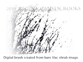
Even a very poor photo can produce treasure. I selected a portion of an image from my backyard. I liked the lacy branches against the sky. Thanks to Michelle, I knew how to make a digital brush. By adjusting the hue and opacity, I added more character to my image.
I have continued making monoprints since April's crusade. It's a great way to use up dabs of paint and I like the way it works with tissue paper. I scanned this page and converted it to brush-like layer for digital editing.
This is my finished mixed media painting. You can see the variety of colors that didn't seem to go together. Sorry, I don't have any progress shots on this. It was really ugly for a while. Really!
I added layers of distressing. Uglier. I was ready to cut it up into ATC's. Remembering Matisse's observations about black paint inspired me to stencil across the entire page using black paint. It was a risk, but I was hoping the black would illuminate the colors on the page and bring a unifying factor to the page.
I was thrilled with the results. In fact, I framed the finished page after scanning it! Then it was time to do more.
This was a challenge about scale. For me, that means thinking big, too. I decided to push past my usual comfort zone and add layers with Photoshop Elements. Adjusting the transparency and color of my digital brushes gave me the above results.

Why don't you join the in on the fun?

Monday, May 10, 2010

Believe


Face2Believe.jpg
Originally uploaded by rgrdesigns
This is another mixed media project from All NorahS Art Faces on-line class that I finished this weekend. "Believe" is on a 4" x 4" canvas. A few minor adjustments to her face and hair were added since the previous post. Napkin and tissue were collaged on with Golden Matte Soft Gel. Using Staz-On ink, I stamped "believe" on rice paper that was colored with Ranger distress ink.

I was asked if she is based on anyone. Yes and no. There is much instruction on drawing faces that gives basic guidelines for placement and size of facial features. So, in that sense, she is "generic". However, I did refer to a photo of actress Amy Adams for the general shape of her face.

In the class, Sharon demonstrated blond hair and green eyes. I'm working my way to the brunette side. I knew that using only brown would result in flat looking eyes and hair. There are shades of gold, brown, rust and even deep burgandy in her hair.

I have two more canvases prepped for faces. Our instructions were done with Folk Art Paints which are very economical. But I'm ready to try working with Golden Open Acryllcs. My next challenge is to try mixing my own flesh tones.